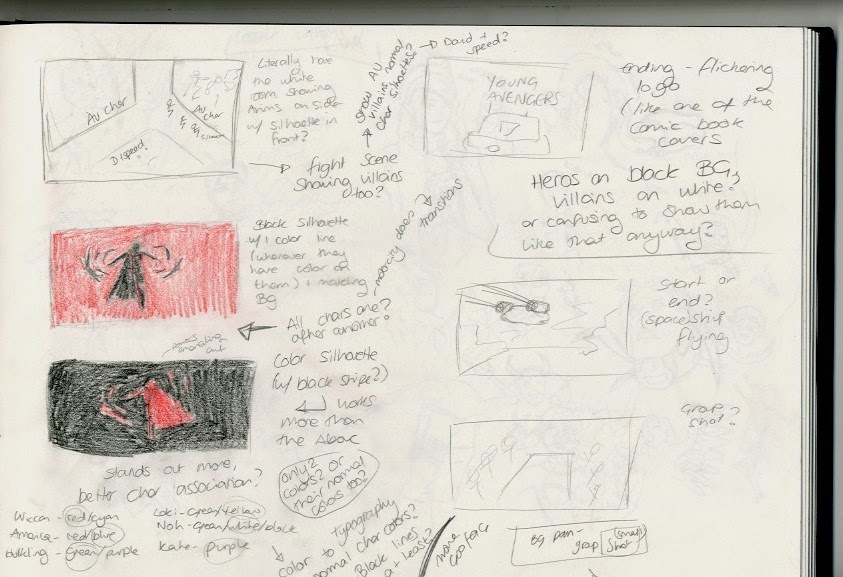
For the storyboards, I looked back to my notes about things commonly used in cartoon openings (silhouettes, colours, framing etc) and flicked through the Young Avengers comics that this opening is based off to inform me of what sort of things would be effective, and what needs to be included storywise.
I wrote down some vague ideas of stuff to include as a starting point, with plenty of annotations in case I got stuck.
I started off by looking at a few comic panels, and seeing if I could build anything off them, or use them for inspiration. I found a few panels of space ships with speed lines and nice horizons, which I thought could make for a fun opening shot, so I experimented with some different angles and frames and way of moving the shot to find something that could work.
I also wanted to end shot to somewhat link with the beginning, but also end conclusively. One of the covers of the comics I vividly remembered was a diner set in space with the logo above it, and I thought that that could also be a great way of establishing what show it was. Again, I looked at angles and camera positioning - I knew that a long shot would be a good way to end it, so I found a way to use that in the ending.
Another part of the comic that stuck in my mind was the characters running through a white space with comic panels around them, breaking the fourth wall. I thought that this would a very interesting idea, especially if I could use the panel space to show things that wouldn't have fit in the opening like villains etc. I knew that I wanted some sort of panning on this to show the space properly, so I looked at ways that the camera could move and the positioning of the panels.
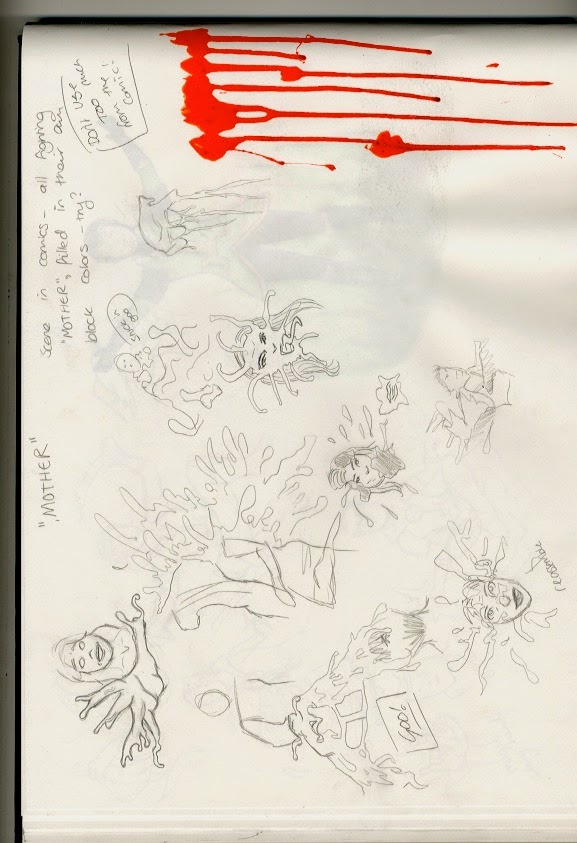
I also really wanted to show the villain, who is basically made up of some goopy substance, and breaks off into that when hit before reassimilating. This would be extremely fun to animate, so I thought about having a close up with only that character in the shot (possibly reaching out) and then show her goopy powers.
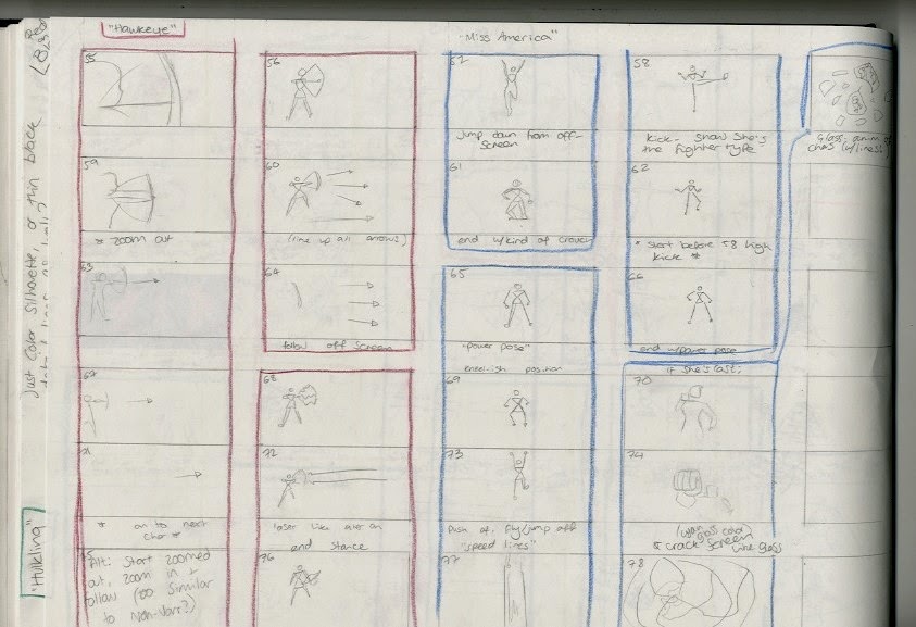
Then I knew that I definitely needed to show the characters separately as an introduction, so I did a few preliminary sketched to get their personalities down and find some of the poses and actions that they would normally do. Exploring the characters like this was one of my favorite parts of the design process.
I made sure that I had enough boards to have a few different options for each character, in case some got too similar. Some characters were easier to think of ideas for than others, but it was interesting to find what best shows the characters' powers.
Finished Storyboards in Part 2!


No comments:
Post a Comment