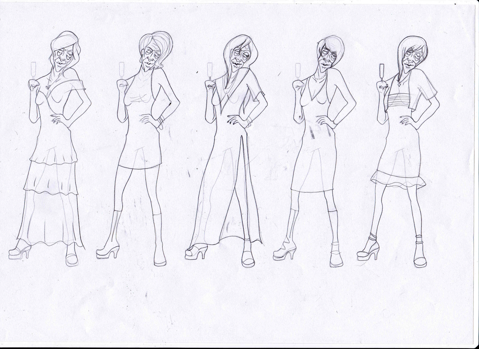
I decided to carry on the development of the figure in my last few drafts, since she looked better and had the most personality. The dress on the first iteration worked well for her. so I wanted to try a couple more here. I like the idea of the character trying to look 'classy' - obviously lots of somewhat saggy cleavage isn't really that classy but I like the contrast of the attempt and the final result.
I feel like this dress on the full character works for her body shape, but it isn't quite as interesting as the last design, and the hair definitely isn't either. I don't like any of the other hair ideas I did even though face/body/personality-wise I am happy, so I printed off some templates so that I could create more designs a lot quicker.
I liked the hair a lot on #1, but definitely not the dress.#2 and #4 were a lot interesting in terms of clothing - I feel like you would definitely see #2 on a friday night at Yate's pushing people out of the way on the dance floor and complaining loudly at the bar. #4 is probably a bit more subdued than that.
Fro this page I definitely liked #2 more, with a mix of the better working elements from the last page. #3 definitely looks like an interesting character, but she isn't quite what I'm going for for this project. #2 is a good mix of classy and not so far, so I think that's probably the design that I'm going to work with.


No comments:
Post a Comment