Saturday, 28 March 2015

AA: Cake Man Turnaround/Expressions


I feel like these exaggerated expressions represent Cakeguy pretty well - he's a guy who shows exactly what he feels, and doesn't try to dim down his excitement or whatever else. Though we may not be using all of these, I think we have a good representation of how he will be animated and react to things in terms of expression.


Friday, 27 March 2015

AA: Johnny Turnaround/Expressions

We don;t want Johnny's expressions to see too exaggerated all of the time - he is a slightly more serious child, studious almost, and he isn't that excitable. The isn't to say we want to portray him as moody, but w want his personality to contrast with the Cakeman's very enthusiastic personality. Some expressions would still be quite exaggerated for effect, but I have tried to show more neutral ones for Johnny.


Wednesday, 25 March 2015

WeTransfer Test Animation

Doing a digital flipbook would be much more practical than a physical one, plus it gives me a chance to show it online as well. It demonstrates our designs much easier and is something I might consider doing to show more development work in the future.

I'm really happy with how the gif came out for this, so doing an even longer one with some more of our designs will be fun. The hair doesn't match up completely but there aren't a lot of ways around that without making them all have the same hair, which we don't want to do. I think that I'll leave this uncoloured so that the difference in hair isn't quite as obvious - lineart is a lot more forgiving 

I wanted to add some motion blur to this, but it didn't work out as well with my lines being transparent. I'm not even sure how well it would work with white backgrounds, and I think that it probably takes away from the designs themselves, but it was interesting to thing about and mess around with some of After Effect's settings.

Image and video hosting by TinyPic

Monday, 16 March 2015

WeTransfer: Hybrid Designs


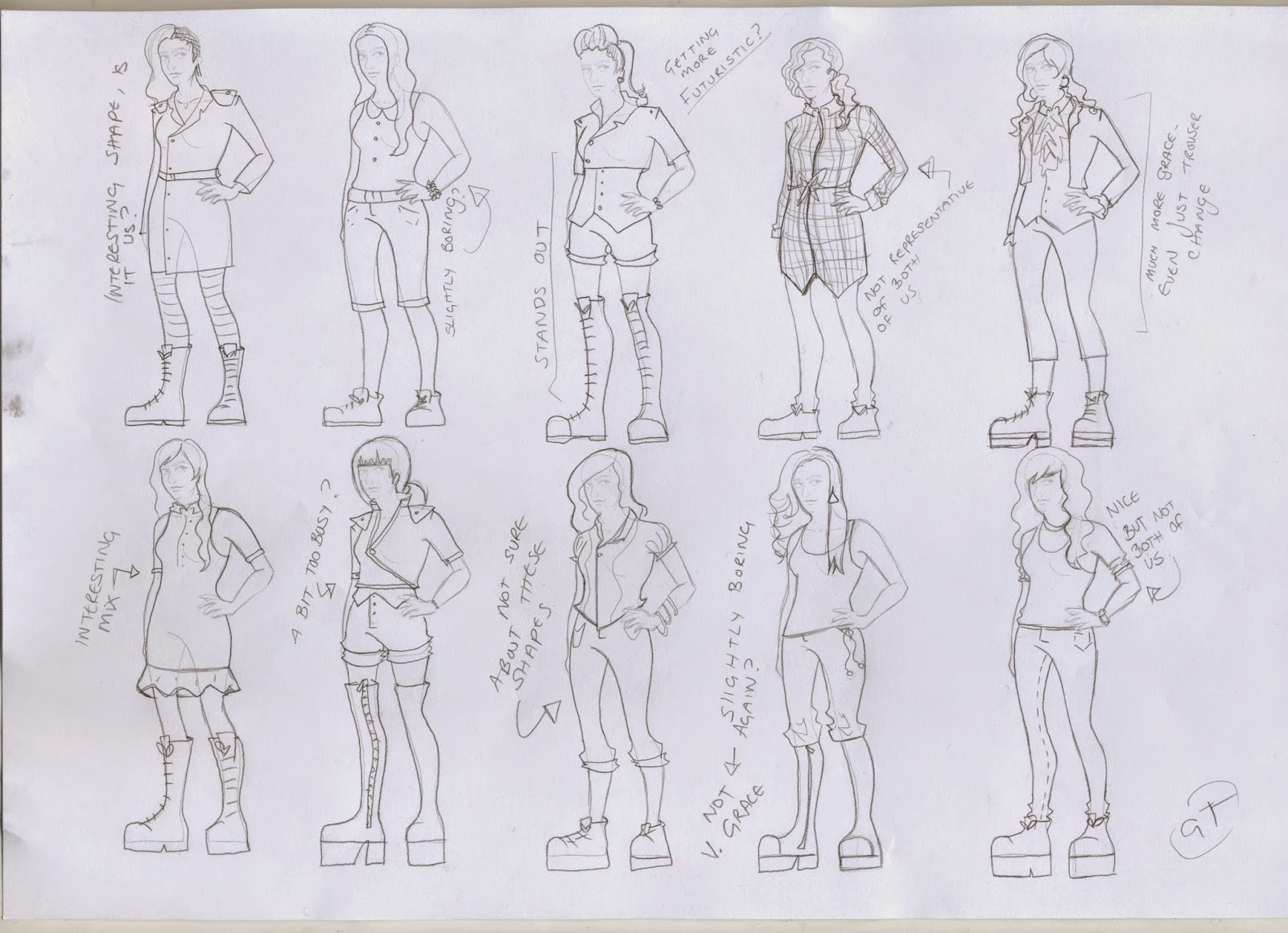
After looking at some of Grace's designs, I thought about what ways to best mashup our designs and turn them into something that works as a mix for both of us.


I feel like lots of layers definitely works here, since we have more clothes to combine and that's generally one of the main parts of my own designs. Her outfits, in my opinion, tend to look a lot less casual that my own so I tried to incorporate that into my newer designs.


I added a few more futuristic versions of some of the clothes I put together, just to give another thought to what fashion could be like in ten years time. I do like these designs but I will need to confer more with Grace to decide on what sort of design we want to go with.


Sunday, 15 March 2015

WeTransfer Pitch Board and Feedback

The background IS white on the slides/files, just not Blogger for some reason


Feedback:

"Very ambitious. A lot of work in a flipbook, particularly with detail in costumes"
"looks very pretty
Flipbooks are a cool idea but lots of detail in it
It would appeal to students"
"Consider how realistic you want the style to be ---> needs to fit with the target audience"
"I think maybe company names, page numbers & company would make the boards look more professional"
"Is it like a flip book where its split into 3 so you can change the outfit? cos that is a cool idea"
"You can't show other peoples' work in final boards"

I agree with a lot of the feedback about how ambitious the project might be, at least on my part - simplifying it down to only line art might be a better option, and noted could always be added later, or separately. Our main aim is to show the different outfits/combinations that we might wear in the future, so we are definitely going with the flipbook idea, but simplifying it will probably be best for the time we have. 
Adding our names could be a good idea to make the boards more professional, so we will have a play around with that. Regarding the other peoples' work comment, a lot of others seemed to have research involving other artists's work as their research so that the viewer has an idea of what to expect, but since the gifs won't work anyway we'll change it.

Friday, 13 March 2015

AA: Early Cake Stand Designs

I'm focussing on the main, present day cake cart/stall/stand for now; we want it to look fun and happy and full of cakes, but not overly sweet. It needs to not contrast with both of the two main characters, and give both of them space to move around inside it, especially as the Cake Man is so tall.


The first design that I have has too much detail I think - it is very short, and filled up a lot with parts that might make it a lot cluttered when the characters are there. The second design is a lot more open, and I really like the cakes along the side of the cart. This puts them out of the way of the characters and allows for more movement, the I think that the stand itself is too wide and the sloping front might look a little weird.


I really like the detail for the leg/wheel/ornate parts of the stand on the left - they look a little more sophisticated. Again, there is too much going on though, and might make some of the animation awkward. One of the biggest problems in the height of the cart though - again, a lot of these would be too short for Cakeman but that is easily fixable. The second cart is better - the centre is much more open, so the characters have room to move without too much distraction, and the amount of cakes have been placed much nicer. I like the doors advertising other cakes as well - you can see them clearer than the ones in the cart itself, and box the scene in nicely. Cara also liked that one for these reasons.


I looked at the side parts of the cart a little more for the next designs - I do like the rounder edges, but the top doesn't work as much, and I feel like the cart of the right hand side is much better size wise. I really liked the detail on the legs, so I decided to keep that, along with the little detail in the wheel. We are very happy with the second design, although I might add more more cakes/detail around the front of the cart, since it looks a bit empty. Beyond that, I think we have our cart.


Thursday, 12 March 2015

Qwertee Monster Trio Designs 2


I still wanted to try adding more circles, but the characters' silhouettes are a bit too complicated for that much other colour.  The top and bottom blacks aren't quite as bad, but I want all 3 to work as well as they could do.

And outline and less colour was a lot more effective, but I'm not 100% sure about it still. I feel like I'm missing out too much of their figures - their whole bodies are important in their silhouettes, and these designs don't really help that.


I tried using their Jolly Rogers instead of silhouettes, which I think goes with the circles better than the silhouettes, but that isn't really the sort of design I'm going for, I might look more at this for other designs in the future. With the amount of black, smaller detail in the bottom design, they actually work quite well with the blocks of colours, so that could be a future design.


 I went back to some of the original designs in the end, changing around the shape and placement of the blocks. You can see the silhouette a lot better, and I think they are a lot more interesting - there's less going on, letting you concentrate in the three characters, and they stand out well.


AA: Cake Man Colours

For the Cakeman's colours, I decided to experiment a little with different media, just to see what I could achieve. It was interesting trying to combine the colours that I wanted just because traditional media, or at least the selection I have, is a lot limited with colours, and some I have a lot more trouble trying to mix, meaning that I had to limit my palette a lot more.

I went for pastels first since that was what I had the least amount of colours in (and the least amount of experience). I didn't particularly find any good colour schemes or find using them helpful, especially since I printed off copies of the Cakeman to colour over; maybe with new, looser drawings the pastel would have looked better and could have been easier to experiment with, but it didn't work all that much for this. If I absolutely had to pick a colour scheme from this, I would say maybe the first or fourth Cakeman - the softer contrast works slightly better within this project, and he looks friendlier.


I used my regular pencils after that, that has a little more range in colours. The last two work much better - it goes with the themes of the animation a lot more, although I feel like it might actually be better to have more contrast there - or at least lighten the top halves a little bit mire.

I then tried gouache which I don't have a lot of experience with. I find it marginally easier than watercolour, but I'm just not that much of a painter. I did like the opacity though, and I feel like that is a much easier way to judge the colours for this project as we want lots of areas of bright, flat colours. The three of us liked the second Cakeman a lot - it works better than the pink/blue ones earlier, but our only problem then is that his colour scheme might be just a little too close to Johnny, and possibly to the cake cart as well since we were considering more brighter colours including pink.


Lastly, I did a set of colours with my markers, which I am much more confident in. the winner on this page was actually the ginger/purple/green one; his colours are a lot more different than Johnny's, meaning that they should work together a lot better. Some parts might need lightening a bit, but we do like the contrast with the apron. Purple can be good for a 'mysterious' character, but we need to be careful with his body language since purple is also popular for villains. Cakeman is more supposed to be a very eccentric, and I feel like the colours work for that - he doesn't look as friendly as the pink/blue scheme, but he doesn't look unfriendly either. Since we have had a lot of good feedback for the ginger/green/purple scheme, I think we are going to go with him.


Wednesday, 11 March 2015

BBC Influence

Notes from BBC to maybe implement;

"- make sure style doesn't impose itself too much on character and story - squash + stretch etc used w/o distracting for Simpsons. ---------------->" we don't want the animation to stop the audience from listening properly - the more exaggerated and stupid it is, the less attention might be paid to the narration.

YOU MUST LOVE YOUR CHARACTERS -if you don't love them why should anybody else.

"Youtube is where their audience is going. British productions getting more money. Not sure how long Broadcasts will last" - using the internet as a place to show animations is more popular, and would be very good for us as it is easier to create and show self-published things, even though the whole marketing, getting an audience and obviously not getting paid is an issue, but if we are considering this as an episodic place, YouTube would be a great platform for this.

"Easier to sell preschool things because toys." Mascots, cute things, simple designs that could sell well if this was to become something bigger, since toys obviously generate a lot of profit.

" ALL ABOUT CHARS + RELATIONSHIPS. Spongebob v popular b/c character driven comedy." Make the characters interesting and likeable - we seem to have very positive feedback so far about our characters, including the script; Cake Man has a lot of personality and how he acts with Johnny and we have had a lot of people commenting on how they enjoyed that, so I think that we are okay there.

Saturday, 7 March 2015

Schedule 2


Rebecca made us a schedule to get started off with the project, which would be nice to stick to. The only problem I see so far is that Rebecca wants to design the backgrounds, which she has down at the same time as animating. Depending on the amount of backgrounds we have, which we won't be 100% sure about until Cara does the storyboards, she will either have to pass them onto someone else or make sure she animated very fast. Having around 2 months for animating isn't too bad, but since our initial storyboards and animatic appear to be over two minutes long, I am just wondering if this is the best idea, especially since Rebecca doesn't have too many duties the week before that.

Another problem we could have is that the storyboards aren't finished yet - they need to go through more revisions, because of other module commitments. Those have also slowed me down slightly myself with the colour, cart/prop designs, but colour is something that isn't an immediate issue yet, especially since I have the turnarounds done which is enough to get animating from. The props I can put in later, and I might benefit more from waiting for Cara to finish the storyboards before deciding on a finished cart, because she is using carts from a lot of framing at the start and I don't want to design something that then gets in the way of her shots.

I think that it would be best for me to start cleaning up the line art as soon as possible instead of leaving it to the end, meaning that I can wait for every storyboard to be done before sorting out the marketing stuff, in case things change. We still have plenty of time, so we're not doing too bad even if we are slightly behind schedule. Most things now depend on the storyboards being finished, and then we know everything we need to design, animate and think about for marketing later on.

Friday, 6 March 2015

Pitching - What To Say


To consider for pitching -


The Two Minute Pitch

Idle Man Ad Campaign


Strapline;

Campaign to get young men aware and interested in The Idle Man


What is the objective for this pitch?

What are you looking for? Money? Partnerships? Skills?


3 Key Elements

Eg characters, plot, platforms


1. Young adult men

2. Fashion

3. Internet Campaign


Who is the target audience?
18 - 15 men who want to be fashionable

Why will it appeal to them?
Fashionable, relatable

Who are you pitching it to and why?
Illustration students

What do they need to hear?


The Two Minute Pitch

Prep Sheet


What is the story you are going to tell?


How will you start your pitch?


Key points:

1.

2.

3.


How will you wrap up the two minutes?

Tuesday, 3 March 2015

WeTransfer: Fashion Illustration

I have considered looking into fashion illustration, since that is something that sounds like it could be relevant to the flipbook side of our project, and will also give me something else to think about when designing - proportions, figures, colors and of course clothing are all pretty different when designing characters as opposed to designing clothes or just creating illustrations.


I do love a lot of styles found in fashion illustration, and it is all really nice to look at - but this project is about how we may be in ten years time, and even when combining my designs with Grace, I don't think using these sorts of poses would work for us, or proportions; we're both fairly short and of average build, so I don't think that the exaggeration is relevant. Still, it is something I will keep in mind for later projects - it would definitely be interesting to look at again.