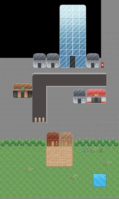
I wanted to try something different; a lot of shapes etc are still similar but I really like the effects of the grey overlay, using vertical and diagonal lines on the houses. It feels a bit more 'graphicy' and modern, which is why I tried to out on a city kind of place. The gradients help it to look shinier which also works for this setting. The trees look a lot better than my early ones, with much higher contrast. I also used a gradient on them from the top to the bottom and a grey overlay on the sides so that they feel less flat.

I tried throwing some more different colour schemes/Blending layers just to see. I like the simplicity of the second one with only yellow and greys. Grey goes well with the city kind of feel going on, and the shades of yellow make it look quite dreary ad depressing.


No comments:
Post a Comment