Tuesday 28 January 2014

LIFE DRAWING [DECEMBER 2013]

After not having done life drawing for at least the last 6 months, I thought it was time to get back to it.

2 Minute
Need some stronger lines, I think. The third one, and the curve of the second one are much more improved but they still need work.


2 Minute
Slightly better lines, but still not quite consistent enough. I do like some of the shapes I have achieved, though.

5 Minutes

10 Minute/30 Minute
The 10 minute one is actual my favourite; I feel like I done some decent shading that help gives a bit more weight and depth to the model.


Wednesday 22 January 2014

Nationwide


This advertising campaign uses a mix of paper stop-frame animation and live-action to create a memorable pop-up world. This method takes a long time, with the amount of precision needed in both making the paper town and making sure that it is completely to scale for the people to be composited in later on. I like how adverts are becoming a very good medium for experimenting with - they are short enough that it doesn't cost too much money or take too much time to try and make things like this, whereas even just a 20 minute show would probably cost much more to make than the profit they could make from it. With the lack of character concentration, and more emphasis put on the actual idea behind it (banking), I think it also allows you to appreciate the paper town and animation much more, especially if you are the sort of person who gets bored between TV breaks easily. Adverts are also seen by a very wide range of people, meaning that this kind of animation can be found more easily than if it was put online as art.

I love the amount of detail put into this, but I would have liked to see a lot more interaction with the environment. I know that this would be trickier to implement, but the town looks so much emptier and less effective than it could otherwise.

Foster's Home For Imaginary Friends


Foster's Home For Imaginary Friends was made by the creator of the Powerpuff Girls for Cartoon Network, Craig McKraken. He wanted to take a step away from the 'graphics style' thick black lines of the PPG cartoon and try something completely new. He also wanted a universe where he could always design and invent new characters without them necessarily having to be a bad guy, like in PPG. Foster's Home for Imaginary Friends uses a lot less cartoon violence and action than the Powerpuff Girls, instead relying on characters and dialogue, meaning that the scripts are created before the storyboards, as opposed to starting with storyboards on the Powerpuff Girls.

The background and character artwork starts off hand drawn, which is then scanned and made into vectors in Illustrator which allows them to be resized whenever needed. The characters are then animated in Flash and then composited in After Effects to create the finished animation. This means that they can reuse walk cycles or simple movements/poses that would need to be animated more than once, to save time and money. This show, from 2004, was one of the first shows to use a combination on hand drawn animation, Illustrator Flash and After Effects, and the outcome works very well. I love the style and how it differentiates from a lot of cartoons around at that time, and it is something I would like to try out at some point. The method would also be interesting to try out for a future character based animation.

New Leaf [Music Video]


This is a music video for the song 'New Leaf', using digital rotoscoping to create a 3D effect, with a hand painted texture over the top.

The camera angles and movements in this animation are done extremely well, and when put with the realistic movements of the animals, it makes a lovely animation. I love hoe the textures of the animals changed between frames, as if each frame was hand painted. The fact that this is only done to the animals and not the backgrounds as well makes them stand out a lot more, and even though they don't look traditionally life like, I think that they feel much more alive. Even when animations have every bit of fur animated separately, the effect of being so realistic is hard to achieve, so showing life this way instead is much more successful.

This video was produced as a way to experiment with new animation techniques, which they have definitely managed to do well. You don't usually see many 3D animations using techniques like this, although Pixar have been experiment recently, as well.


Pixar didn't use rotoscoping for this, instead using their typical methods of CG animation, but they have been testing out more ways to use a hand painted approach to feature films, a much larger scale than what New Leaf accomplished. Artists would paint over 1 in every 10 to 20 frames and their software would be able to fill in hundreds of inbetweens while still keeping the painting style intact. Does this mean that we will start seeing more and more CG animation trying to use more traditional looking techniques, or are these experiments going to be ignore for more hyper-realistic animation that seems to be a trend in animation? Either way, it will be interesting to see the results.

Web Animations


Bravest Warriors is a webseries on Youtube made by Frederator Studios. The series itself was created by Pendleton Ward, the creature of adventure time, which is evident in the series' style.


Bravest Warriors is targeted at an older audience than Adventure Time and other Cartoon Network shows, which is a possibly a reflection on how accessible Adventure Time is to everyone, rather than just their intended audience of children. With Simpsons, Family Guy, South Park etc, I think that adults watching cartoons is a lot more acceptable; especially with the internet now, it's easy to find cartoons that aren't just for children.

Netflix, Lovefilm and services online providing people with easier access to TV shows online are growing bigger, meaning that people don't even need TVs anymore to be able to watch popular shows. I think that creating shows just for the internet works, and that the audience online is only growing.

Adventure Time uses hand drawn animation, so I would assume that Bravest Warriors is created in the same way, even though a lot of online cartoons now are usually completely animated in Flash.

I like how this series is aimed at an older audience - I think that makes it less limited in terms of the content and animation within the show. I also think that diversity in online cartoons is easier to achieve, with less people in positions of power deciding what is and what isn't going to sell; the internet provides more freedom to do what you want, and to tell the stories you want to without having to resort to stereotypes and certain limits in order to sell.

Finished Animation


A few months later and with lots of panicking, my animation is finally done! I lost 3 weeks of time with my laptop charger breaking, but it only goes to show how much I can get done when I really put the time in. I'm not 100% happy with the animation, with parts of it still looking kind of jerky and awkward and if I had another week I could make it smoother, but I think that the sound track definitely helps to make it sound better. It wasn't what I first intended to put with the animation, but I do like the outcome.

Next time I will find something that I can put a lot more time into designing and do a lot more animation tests in advance.

Visual Development - Characters

For my animation, I need to create two characters. Neither will be on the screen for that long, and I don't want them to be the most memorable part of this animation, so I'm going to go for a very simple character style.

Ctrl Alt Del webcomic
Doritos and Pepsi Max
Nick Morland [The Mill]
I've looked at two webcomics for inspiration - these hold more importance to the content than actual character which is what I'm aiming for, so I decided to experiment with their very simple face styles which is the most important part of the characters within the animation.

I tested out simple shapes and expressions,  drawing too quickly so that I didn't over think the design. I had alreayd planned on using block colors for the characters, because the background was going to be block colors already, and painted characters would be harder and probably wouldn't go with that background as well.

The male character only needed two expressions for the whole animation, neither of them lasting long, so I did a test to make sure that I could get enough variation in expression before moving onto the next design stage.


I found a few color combinations that I liked and then tested them against the two main shades of blue that I would be using in my animation. There were a few combinations that I liked, but I wanted to use the first (ginger) color scheme, or something similar for my siren character, so then I had to choose between the top right and bottom left colors. Though I do like the bright colors of the bottom left, I felt like it would probably be too dark for the rest of the colors in my animation, so I went with the top right one instead.


I got a few very loose design ideas down for the siren before realising that you only saw the bottom half of her face - that meant only her hair and her lips, and only for a few seconds, so I decided on one of the simpler set of lips, and on the hair that looked the most damp - I love the idea of lots of curls for women of the sea, but it makes sense that she lives in the sea, so her hair would be wet and a lot flatter. I used the red hair/pink skin colors at first in the animation, and then changed them slightly to look softer against the blue background and colour of the rock she sat on.

Monday 20 January 2014

Motorcity


Motorcity is a 2012 animation made for Disney XD that I love the style of. The mix of 2D and 3D animation is a lot more pronounced than many mixed animations now and the contrast of the smooth CG cars and very angular style of the character design really makes it stand out, in my opinion. The character design is done by Richard Valley, and immediately it reminded me of some of the Gorillaz music videos, which he was an animator on. I love how his style translates to a Disney cartoon, and how separate it is at the same time from Jamie Hewlett's original Gorillaz designs.

For the 2D elements, Titmouse created a Flash plug in for the animation of the faces of the characters, which is noticable in the show, since it doesn't look like usual 2D animation with a lot of the head movements.


This is a plug in I think would be fun and very useful to use on Flash.


The above video shows the stages of animation, with the expressions of the characters' faces animated first in Flash with their plug in, and then composited into ToonBoom for 2D animation, and later added to the 3D vehicles made in Maya, with the special effects are added last. I love how much of their animation process Titmouse puts online; it's really interesting to see all of the steps they take (and terrifying!) I think I would definitely want to have a part in the 2D animation over anything else, before the animation gets too complicated and all added together.

I would love to see these techniques used in a lot more animations for TV. More and more cartoons continue to be made with 3D graphics, but I think there's just a certain quality about 2D characters that can't quite be reproduced otherwise, and I don't want to see that go.

Thursday 9 January 2014

Newest 3D Animations - Disney, Pixar and Dreamworks


Disney's newest film is Frozen, based on the story of The Ice Queen. They have cut out characters and added romantic elements so that the film doesn't really resemble the original story much which is probably what they did in a lot of Disney films, but The Ice Queen was a story I really liked, so I was dubious about watching this. The sound track is lovely and the concept art is even lovelier. The animation has come a long way as well, but I still think that some other Disney films had better animation that this (Tangled - the animation looks very similar in both, and I'm not sure what is is exactly that makes me prefer the latter). The animation has come a long way from Toy Story though, the textures greatly improving and the characters fitting better, I think, with the backgrounds. The effects of the snow and ice is absolutely beautiful though, and something that impressed me a lot with this film. The transition of the snow to ice as Elsa builds her palace looks stunning, and her costume change into the ice dress is some of my favourite animation from a Disney film.


Monsters University was one of the most expensive films for Pixar to make but in my opinion, it was definitely worth it. The textures, especially of Sully's fur is ten times better and a lot of the backgrounds actually made me need to stop and think about whether they were real or not. I think that the character designs were great as well, finding a style for each of the characters in university. I didn't expect them to make Sully be the jock type or make Mike be the nerd type, but it worked very well in this film, and I liked the story just as much if not more than the original Monsters Inc, which was definitely one of my favourite films. I love that they released this 12 years after the original, with a lot of returning fans watching it. The children who saw it in the cinema as it was released would have been at university age as this was coming out, making it relatable but also a nice blast from the past. I definitely thought that - it came out just as I and a lot of people I knew were about to go to university, and a lot of them also went to see it, along with the children of this generation. Accidental or not, I think that it was an extremely good move and good consideration of their audience. Monsters Inc uses the same lighting system as the first Toy Story; the animators stopped using that way of lighting after Toy Story because they 'couldn't make it work' but they wanted to try again and with Monsters University, they found the technology to be able to do that.


Turbo isn't actually a film I have seen yet, but from watching the trailer I am definitely tempted to. The animation has improved a lot from Antz' animation from what I can see in the trailer, and I also like the concept.The art style has completely changed and is much more well lit, and with less humanoid shapes as well, making the animators find other ways to express emotion and actions. The reflections and the lighting from the cars and other gadgets etc in film are impressive and would have had a lot of experimenting to make it work.

3D Animation - Disney, Pixar and Dreamworks

3D animations are a relatively new idea, and I feel lucky to be born in the decade I was; it's been easy to see the transition from 2D to 3D animation for a lot of companies as I've grown up and watched childrens' films and cartoon; being a part of the target audience of some of the biggest animated features has been very good for keeping up with the trends in the animation world.


Toy Story was the first fully computer animated film by Pixar, and released by Disney. It's nearly as old as I am, and it's interesting to see how technology has changed, but also how it has stayed the same in that space of time. CG animation is still very similar now, and the movement and expressions and designs are still great nearly 19 years later. There are definite changes to what the animations look like now from these studios, but a lot of what looks different, I think, is the things they would have tackled in post-processing to make the characters and objects fit in with the background a lot more. It is still a lot more advanced than I would have expected from the first proper CG film.


Antz was the first 3D feature film by Dreamworks in 1998, although not one of the most memorable in my opinion - when I hear Dreamworks, I always think about Shrek, from 2001. I do love the character design in this film, with the amount of character and expression in faces and simplified limbs that makes the movement of their characters easier to animate. Again the animation is better than I had previously thought from this point of time. I do like the use of lighting in this film as well - the warm tones work very well and the shadows are quite realistic.


Chicken Little was Disney's first actual 3D animated film, and looks very different from the films they traditionally made. Chicken Little (Title character) is one of the most adorable character designs in 3D animation, and makes me really want to watch the film. You can see how much life and expression is in the dance sequence at the end of this trailer, and it looks like they must have put a lot of effort in with the character animation.


Snow White and The Seven Dwarfs


Snow White and The Seven Dwarfs was the first fully cel-animated feature length film, and the first of the classical Disney movies - arguably one of the most influential series' or category of films in children's animated films today. It was an adaptation of the classic Brothers Grimm story, and is the most iconic retelling of the story. Thought no one thought it would be successful, Walt disney fought to get it made, and it is probably one of the films in history most worth having been fought for. I love how we have so many iconic films based on fairytales, making them a lot more memorable and well known. If I was to adapt a fairytale, I would want to make my animations as stylistic and memorable as Disney have done with theirs, as you can tell throughout them all both who made it and what story it is very easily, although I would be inclined to look at more original concepts and ideas rather than just adapting things.


The newest 2D Disney film of the same technique in the Princess and the Frog. The animation since has gotten a lot smoother, and a lot more ambitious with techniques. Especially in the clip shown above - they try a completely different almost vector style, using no lines and much more stylised ideas that aren't seen in other Disney films. They stick to very strict colour schemes instead of what was around her before the song started, and has a completely different effect than other Disney songs do. I personally love this style and how they dared to try something different. Even if it wasn't their most successful film, I think that Disney could do a lot more if they used some of the ideas or willingness to experiment from this.

Wednesday 8 January 2014

Matches An Appeal and Humorous Phases of Funny Faces

Some of the earliest animations were stop motion, made just over a hundred years ago.


Matches was the first - An animation made for match company Bryant and May. They asked for donations of money so that they could send matches out to British troops fighting in the Boar war. The animation uses matches, photographed one movement at a time. The matches write out a plea to have money sent, and I think this works very well, firstly because it was new, using techniques people had never seen before, and second for the idea of actually using matches to show ask for money, making the animation actually relevant to the cause. This animation brought Britain even further in front of other European countries in terms of animation, and was a starting point for many of the pioneers of animation now.


Stop motion and cut out elements were used to make Humorous Phases of Funny Faces, using hand drawn images to makes the expression on the faces move. This was made at 20 frames per second, making the animation fairly smooth. It begins with just film, as the artists' hand is shown drawing out the first character, then the second appears using actual stop motion techniques. This is widely regarded as the first animated film, with some arguments about whether Matches Appeal [above] was actually created at the time it claims to have been. HPoFF was made in 1906 in the United States for entertainment purposes only, and was a silent animation.

I prefer Matches of the two just because of the idea behind it - the animation was made to ask for money for matches, so using matches in the actual animation and making it relevant to the cause is a lot more interesting. Since we have much more choice of animation to watch for entertainment now with new technology, HPoFF doesn't have the effect on me tat it would have done on viewers at the time,  so I think if this was 100 years earlier I would have enjoyed it a lot more.


Live Action + Animation


Bedknobs and Broomsticks is a 1971 film that uses a mix of live action and animation. A lot of the animation used to mostly in the background, with the actual footage of the characters composited on top, with just a few exceptions where the fishes and bubbles are animated on a layer about the characters, the show them swimming and moving in the foreground rather than the background.


On the other hand, Mary Poppins (1964) uses on a painted background, with the animation in the foreground and as extra characters. I think this makes the animation come alive more and feel more realistic; the animations are reacting to their surroundings, whereas Bedknobs and Broomsticks seemed just awkwardly placed above it all. This probably would have taken more time and be more expensive to do, but I think it works much better. It also gives the audience much more to look at, with a much livelier scene - as the target audience is children, I think this is a good idea because it keeps them much more engaged.


I think that Who Framed Roger Rabbit (1988)  has an even better used of mixed animation and live action than the two above, however. The character of Jessica Rabbit is fully animated, with a wholly live action background - this means that she interacts completely with the real set and with real actors, giving the animation a lot more life, and focusing on her rather than making her a background piece as real life action goes on. This is more entertaining and engaging, and it is interesting to see how well it works.


Space Jam (1996) does the exact opposite, with a wholly animated background but live action characters. This technique is similar to Mary Poppin, except that there's a lot more animation in the background (and not just for one song) and the characters, live action and not all interact a lot more with the background, whereas in Mary Poppins the background was largely ignored and unneeded. In fact, even taking out all live action elements of Space Jam would still make it watchable, whereas Mary Poppins would have very little ever happening if you did the same to that. I prefer this way of combining live action and animation, because I think it has much more life to it in the animated scenes, and the animation and live action works a lot better together, but Who Frames Roger Rabbit is a close second, and the interaction between characters and actors is very well done.

Monday 6 January 2014

Visual Development

Once I actually got started on my animation, I realised that I'd forgotten one huge thing; I don't know how to animate water.
This meant that I'd have to figure it out soon, because it could affect the whole visual style of my animation. I tried two styles to attempt to animate. I didn't like the way that either of them worked, so I decided that I should find some examples of animated and real water to get a feel for the movement and how people show this in animation.


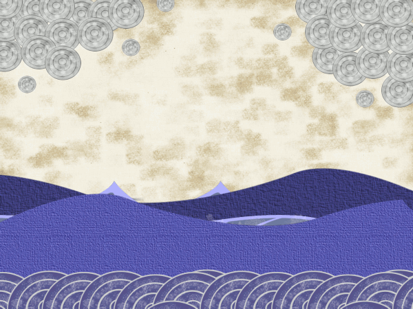
Gradients and vectors
Pastel brushes with block colour in foreground

Research;


I really love how this gif moves, with the different layers of water moving in different ways and at different speed. It gives a good sense of depth, and how different volumes and speeds of water moves. This is something I don't think I could try in Photoshop though, which is what I was planning on doing all of my animation in, since I have access to it at home. I might try this style in the future with Flash or After Effects if I need to try it again.


Orange Ocean Sunset
The soft ripples of the ocean in this gif is like the speed and movement of water that I'm intending to have for a lot of the sea in my animation. However, there is a lot of detail here, and to get a smooth animation with that much animation for about 15 would take me way to long to learn, never mind actually manage to make.


Oceans from Sol Linero on Vimeo.
This video uses similar techniques to the first gif to show waves, using very different textures to make ii seem a lot less 'cartoony', although the water at about 0:55 seconds and at the end does seem to be a lot more in the style of the first gif. Still, these look like techniques that would be hard to recreate in Photoshop.

Steven Universe
Steven Universe is a show that I get a lot of inspiration from, and I would love to use the kind of style that they use, but I could find any examples of the sort of water movement I wanted, so it made trying to animate the water like this a lot trickier.

Left: Lilo and Stitch | Right: The Little Mermaid 
My first thought was to look at certain Disney films that involve a lot of water, but I forgot that a lot of their backgrounds are painted and involve the sea. In certain parts where the sea was animated separately and was not a part of the background, the movements were too faint compared to what I wanted. I was half tempted at this point to just keep the water still, but I didn't think it looked as good that way.

Avatar: The Last Airbender
Avatar has another style I wanted to use, but their waves were much more violent than I wanted, so that was out of the question.


Cocoon - Dee Doo
I really like the style of this water, but it doesn't really work for the sea. I would be very tempted to try out this way of animating water if I can something river or stream like in a future project.

Cocoon - Dee Doo
This style uses Flash or After Effects again, even though it was a lot closer to the kind of movement I wanted. Next time I will find a way to be able to use more than one kind of application to animate so that I'm not as limited in what I can animate.

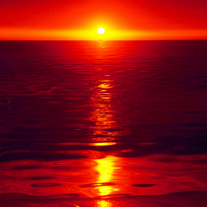
Marine Management Organisation
This also works for what I wanted but again, it wasn't something I could make Photoshop.


Ponyo
After asking around, I managed to find another animation that movement on the sea, but wasn't violent waves. I decided to try this out, and it was a lot easier to animate movement than the other style. I'm still not 100% happy with how it came out, but at least it is a start, and next time I will give myself more time and and access to other problems to tackle things like this a lot easier.

My finished animation

Storyboards and Animatics

Storyboards and Animatics


I will be looking here for audio: http://www.youtube.com/audiolibrary

Saturday 4 January 2014

Visual Language - Wind Mills


WindMills from Wind Mills on Vimeo.

One of the things I noticed the most from this video is the colour and lighting in the backgrounds; wherever the child is, there is always some part, usually small, of the background that is filled with bright, saturated colour, which contrasts with her father's scenes, which are always dull and dark. This is used to show the mood, where the father's life is always dreary and depressed, to the girl's where, no matter what, there is still always that spark of childish excitement and optimism. The colour and lights dim once again when she drowns, but once her father finds her and she reawakens, the light and colour come back, and with his happiness at her being alive, even the father's scenes gain some of this.

The background textures are what I would expect to be a very odd contrast with the 3D elements of the characters, but it actually works very well. The texture of the grass looks realistic in this, whereas I don't think it would if it was put next to 2D characters. The rain and wetter scenes look like they could have been done with wet media like watercolour, again making the background feel more real.

Most of the backgrounds seem to be at an angle - this could just be a reflection of the angled of the actual buildings, if there has been an accident and they are ruined, but it could also be showing the change in moods between each characters' scenes, or just showing the actual literal direction of the scenes - which way the characters are coming and going from.

Visual Language - Green Lantern The Animated Series


Green Lantern The Animated series changes location every episode, with different alien planets used for the backgrounds.


For the calmer, less hostile environments like the bottom three on the left hand side, the colours are much more muted, and the backgrounds feel a lot softer. You can tell in these that the characters are much more likely to just be exploring or travelling through these locations. On the right had side, the colours are very saturated, helped by the more dramatic lighting made by certain elements of the background giving off their own light. You can tell that these are places where something much more significant will happen.
The Rule of Thirds is used especially where there are clearer subjects on the right hand side; there's a clearer contrast between foreground and background because of it, so that the audience will notice what is happening/who is there before seeing the background

Visual Language - Steven Universe

Steven Universe is an animation I have found recently from Cartoon Network, and it has a very unique style that makes it a lot more interesting to watch.


Above are some of the backgrounds in the episode 'Laser Light Canon'.
 The first thing I notice from these is that the colours start off very soft, showing the calmer atmosphere at the start of the show. They slowly change into brighter and much more dramatic colours as the action starts, also showing the transition from morning, to day, to night. The town starts off with warm colours like pink, to show dawn, turning to yellow as it hits midday. Though it is surrounded by dark clouds, you can still see the colours shining through, which then moves into red, for dusk, and also the most dramatic part of of the episode with the most action, and then down into blue, to show the end of the day and the episode. The blue is still very saturated which isn't something I would associate with night time scenes, but the tones are much darker, and are different shades to the usual day time kind of clues.

The composition of the backgrounds help lead your eyes into the scene - it starts off with a road veering to the right, showing you the direction of the story before the scene moves over the the second image, where the characters are, and where the story really starts. The next few are very plain with little direction; this part of the show concentrates on the actions of the characters rather than movement through backgrounds and they only change after certain close up shots.

The brushes used for the background give it a very soft texture - the show over all feels much calmer, which works for the younger audience. The action is less violent as well, meaning that the colour is needed more to set the tone and to create the drama. On the red background, where most of the drama does happen, the background shapes are slightly sharper, using less colours for shading and highlights, helping to move even more away from the calm atmosphere for a scene.