This is absolutely beautiful. The animals represent the houses and the battle between them from the throne using lovely a painting style. The backgrounds are great, but my favourite part of the video is the fight between the Stags (representing the fight between brothers Stannis Baratheon and Renly Baratheon). It's one of the livelier parts of the video and it just looks so nice.
Thursday, 31 October 2013
Game of Thrones Fan Animations
While we're here, I might as well show you a few animations I found that I really liked. (Yes, I do like Game of Thrones. Can you tell?)
I really love the simplicity with this and how the camera just pans across to show the different places of Westeros, rather than jumping round (which may be more geographically accurate, but a lot more complicated).
This is absolutely beautiful. The animals represent the houses and the battle between them from the throne using lovely a painting style. The backgrounds are great, but my favourite part of the video is the fight between the Stags (representing the fight between brothers Stannis Baratheon and Renly Baratheon). It's one of the livelier parts of the video and it just looks so nice.
This is absolutely beautiful. The animals represent the houses and the battle between them from the throne using lovely a painting style. The backgrounds are great, but my favourite part of the video is the fight between the Stags (representing the fight between brothers Stannis Baratheon and Renly Baratheon). It's one of the livelier parts of the video and it just looks so nice.
Parkour Motion Reel
Parkour Motion Reel
This animation is in a really interesting style; it requires great timing to be able to film this, as well as being able to remember the order without the help of a computer or any machinery, like now. It also shows great technical skill, both with layouts, movement and inking. It would be good if the video was speeded up slightly, but I think that this shows movement extremely well, and could even be used as a really good demonstration tool for certain things in parkour; obviously there's nothing like trying it yourself, but having an aid like this to show you the steps of it would be very convenient.
Stanley Pickle Pixilation
I don't like Pixilation as much as some other animations (but maybe that's because I'm less a fan of live action), but I really do love this one. The visuals are great, and I really like how everything is made to look quite happy and normal at the start - I didn't expect it to go the way that it did. The colors are very comfortable and friendly and the animation is fast enough that it looks at first like it could have been just filmed. I think it was probably done on ones with it being so fast.
Traditional Animation - Pendulum
We finally tried animating with Acme punched paper on a light table, and it was a lot of fun. It took a while, but I planned the movement and frames out before hand and placed them underneath my sheets so that I wouldn't have to go back and change any frames if they didn't fit. We had to do 25 frames which I managed to do, except I had a bit too much space around the center pendulum, so it swung a little too quickly. I went back and added in about 6 extra frames which made the animation run very smoothly, but I had to take out another 6 to try to keep to the limit of 25. I think it came out quite well in the end, but having tried it with photoshop a few weeks back helped a fair bit - I understood the swing of the pendulum better than I did t the start and easing in/easing out, so it went fairly smoothly.

Next time, I think I'll make my lines a little bit darker.
Game Of Thrones Opening
One of my favorite animations is the title sequence to Game of Thrones (which just so happens to be one of my favorite shows, too).
The idea of the title sequence was to make it easier for viewers to tell where everything happens in the show and the distance between places in the fictional continent of Westeros. There's a map in the Game of Thrones which makes it easier for readers to know where they are, but the TV show jumps between a fair few different places each episode and with such a large cast, it's sure to get confusing easily.
Keeping the title sequence confined to just the part of the map the show deals with would be hard to do as a flat image - it would always give us the question of 'what's beyond the map? What's that part over there that we aren't seeing?' The solution to this was to make the map into a sphere, which also gives it more of a globe-like feel. This helped with the decision of how to light it - from above, as if there was an actual sun shining down on the country.

After the shape is decided on, the concept art starts for each of the key places feature in the opening, and after that's finished, the designs are given to the model makers working in Maya. They added objects and small designs of their own to flesh it out even more.

"Was there ever any talk about the characters being the focal point of the title sequence?
I think it’s the job of the show to do that. You have 90 seconds with the title sequence… so why not do something that the show can’t do? If the production is done well, which this one is, you get all the character development from watching the show." - Angus Wall, Creative Director of the GoT Opening.
The only way actual events of the show are told is by the reliefs above, showing the history of Westeros leading to the episodes we are watching now. I really love the idea of this, because some casual viewers would probably feel bogged down if the show explained a lot more of the history (as the books do), but these reliefs give you a simpler version, using the house sigils (stag, lion, wolves, dragons etc) to explain.
I think that this opening works extremely well for the show, informing viewers as much as the need, while using beautiful graphics and music.
Monday, 28 October 2013
Photography Induction
Photography Induction - Study Task
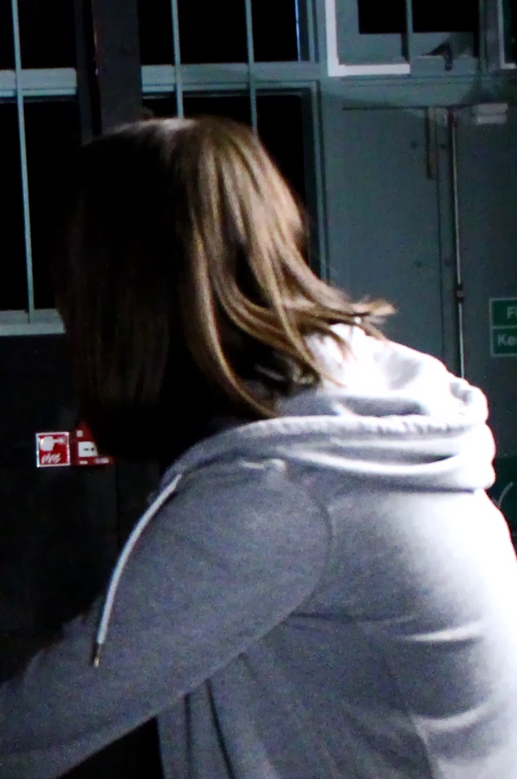
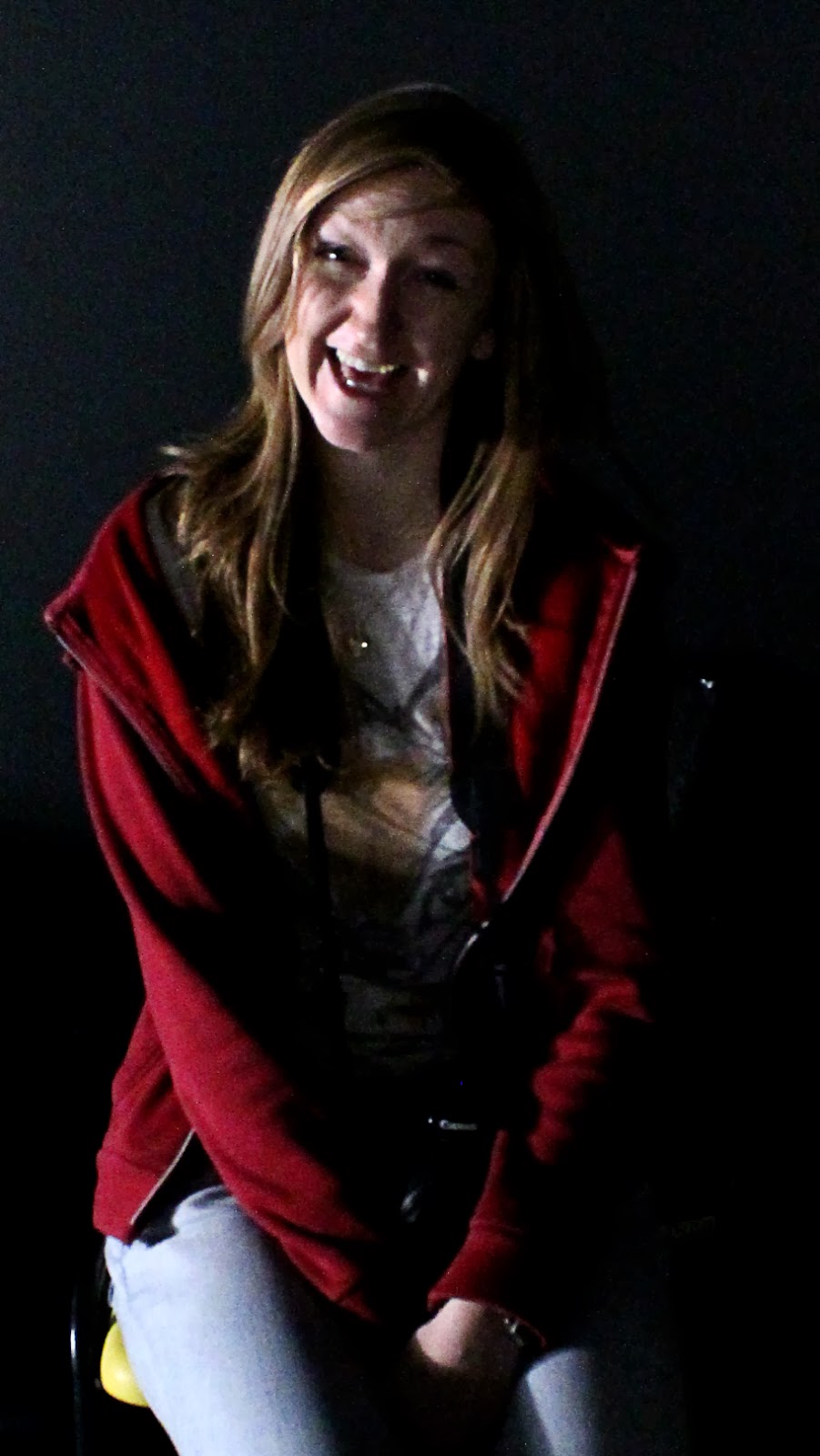
For the last few weeks, we have been in the photography studio on fridays to learn (or re-learn) how to use DSLRs and the equipment in there, including the lighting equipment. We had to experiment with shot framing and composition, depth of field, lighting, shutter speed and aperture. We took the pictures in .raw format and exported them to .tif and .jpeg afterwards. I had the most fun playing with shutter speeds, although if I had the chance to do this again, I would make sure that I had a lower aperture so that my slow shots could be better lit.
 |
| Composition and lighting |
 |
| Depth of field and use of continuous lighting |
 |
| Slow shutterspeed |
 |
| Slow shutter speed and flash gun |
 |
| Quicker shutter speed to capture hair movement |
 |
| Higher aperture with side lighting |
Wednesday, 23 October 2013
Pixilation
For my Pixilation video, I decided to go with a horror theme.


I didn't enjoy Pixilation as much as the other tasks because I felt like I had less control/limited time/ one the shoot was done, I didn't have time to do any more or change and frames, and even if I had, I wouldn't have been able to change anything without shooting new scenes. It was fun getting things set up - although I wouldn't want to have to set up that much every time; drawing what I want rather than making it is much more my thing. It was a fun experience, but not one I'm eager to to try again.
Saturday, 12 October 2013
Walk Cycle
After we finished practicing Squash & Stretch and Ease In/Out, we had a bit of time to practice animation however we wanted. I thought it would be fun to try a walk cycle, since characters are (at the moment) the thing I would like to concentrate on the most. My outcome was...
 Though not perfect, I am very happy with it. It took 3 hours, which is less than I was actually expecting, and also very fun. Next time I need to add more frames - it has about 11 I think, so if I could double that up, or maybe even get it to 24, that would look a lot better, and also if I can have a look at looping making the end and start animations smoother. All in all though, good progress!

Basic Animation - Study Task
TASK
"Building upon your flip book experiences you will begin to translate some of the ideas and concepts learnt onto screen"

First example - Squash and Stretch. I really like how this came out, and the Jigglypuff seems to be extremely squishy which is good, but I think I've actually squashed it out too much when it hits the top - something to think about for the next time, or for a revision of this.

Squash and Stretch with Timing and Spacing was also fun, making the Pokeball bounce across the screen using more frames at the start and end to slow down the movement, putting more emphasis on the drop and bounce back up, to make it seem extra bouncy.

Last is making a pendulum, to explore Ease In and Ease Out. I used a lot more frames with smaller gaps between them at the end to make it look like the pendulum is slowing down. It's less of an actual pendulum movement than I was actually supposed to do, so I've reworked it below.

Here's some proper pendulum movement. It took a few more frames than |I thought to get a smoother movement (and could be smoother still) but I think it's worked quite well. After finding the 'Make Frames From Layers' button, I'm not quite as put off with animating in photoshop anymore.
Flip Book
We used flip books to experiment with squash and stretch and experimenting with how more frames make a slower animation and less makes a faster one. It was fun to see how the shape of the ball we were animating changes to feel and texture of it - more squashing and stretching makes it seem bouncier, whereas a more solid shape fits more for a golf ball or something harder like that.
Pictures or gifs soon-ish. It just takes a lot of time to take separate pictures of 3 full double sided flipbooks, and my video skills are... not good.
EDIT: I HAVE SCANNERS
Pictures or gifs soon-ish. It just takes a lot of time to take separate pictures of 3 full double sided flipbooks, and my video skills are... not good.
EDIT: I HAVE SCANNERS
Storyboarding
"Using a range of storyboarding processes and techniques you are to identify a nursery rhyme and develop a set of storyboards to visualise it. This should consist of no more than 12 panels and should be rendered in a media of your choice. When developing this you should consider how shot composition, lighting and camera movement may affect the overall communication of the storyboards.You can choose any nursery rhyme you like and you should break it down into key frames that describe the action that is taking place. You should annotate the storyboard and you can/should add arrows to indicate any actions or camera movement."


The nursery rhyme I have chosen to do is Incy Wincy Spider (Or Itsy Bitsy Spider or whatever you want to refer to it by). It's a nice, simple nursery rhyme that I know that I thought could be decent for trying out.
I used post-it notes which were a very good ideas; I had to switch some around and replace panels a fair few times before I was happy with how the story flowed.


I did a cleaned up version for annotation and coloring, but I still wouldn't mind editing it more, so I have scanned it onto my laptop to finish digitally, which will let me move any images around and resize (or at least scale down) anything that needs it.


Working with such a small subject is awkward - I feel like I would have had more room to move, and more of a variety of shots of I was working with something bigger or a person, but at least now I know for next time.
Subscribe to:
Posts (Atom)