Tuesday 28 April 2015

AA: Cart Colour Development

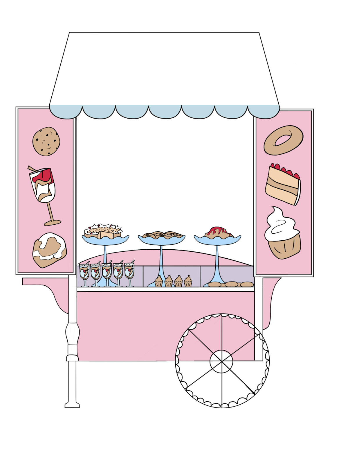
For the first new cart I did, I tried adding more of the bright colour detail in smaller parts of the wood, but I don't like the contrast it has with the rest of the smaller parts - it all of the wood on the cart was darker then it could work, but I just don't like how the light wood and the dark wood looks together. The top of the cart as well is a nice colour and looks good with Johnny, but I feel like it could very probably get lost within the sky.

A slightly more purple background will stand out more against the sky, and the darker wood looks a lot better; the smaller details actually fit in with it, and allow the stands and cakes themselves to stand out, but the only problem is that the top of the stand has a similar colour to the Cakeman's current shirt colour, and since he is close to the top of the stand than Johnny, it is possibly a better idea to make sure that the top half works best with him.


I tried a lighter pink afterwards to work better with the Cakeman, and lightened all of the wood to give the lighter colour detail one more try. It looks a lot better, but it isn't quite there yet, and Rebecca's background has a lot of pink on the floor part, meaning that some of the pink might get lost in it.
I went back to the darker wood after that, since that consistently worked well, and changed the top of it to a more pinkish purple - more of a mix between Johnny and Cakeman's shirt to work better with both of them. I like this design the most, and Cara and Rebecca agree, so I think that this will be the one we go for.

Monday 27 April 2015

AA: Johnny Medieval Design


Most of the research I could get for Medieval outfits that weren't badly made replicas and exaggerated costume pieces is from paintings dating back to that era. Though there a lots of diagrams and other images depicting clothing for the era, I feel like the clothing featured in the paintings would be much easier for children to recognise than the simpler, working class outfits. I didn't really want to stick to a particular class for Johnny for each of these designs, but I feel like going for these kinds of outfits will be much more effective to show what we are getting across, and will seem much more 'old' because of the amount of detail on them that are out of fashion compared to simpler tunics.
The first definitely still looked too plain, and I tried to think about what exactly it was that I thought of first when thinking about medieval times. The ruff was definitely something that came up a lot in medieval imagery, especially when learning about it in school, so that was something that I think would definitely be a lot more recognisable to our audience. It instantly made the design more interesting anyway, especially compared to the tunic, and even just the regular outfits with lace/detailed collars. Making the outfits wider looked a lot better since Johnny had a lot more detail at the top; the puffy sleeves balanced out the design, and adding smaller shoes rather than boots stops the bottom half from looking too empty.
I didn't realise at first quite how bright outfits sometimes were in the medieval times, but after looking at a few images I realised that I still had quite a lot of options. The contrast on the yellow looks much better than the others, but yellow doesn't really suit Johnny. The pink was just a bit too full on and saturated, especially compared to the amount of pink in the previous outfits Johnny had, so I think that the blue is probably the one that would work best for Johnny's design.


AA: Initial Cart Colours

From my research earlier, I had a lot of different cart ideas to work from. The only problem with some of our favorites of those, particularly the pink and white ones, is that they may be too close in parts to Johnny's colour schemes; we don't want him to get lost in the colours behind him, so we wanted to make sure that we explored a range of different colours rather than limit us just to our research - it isn't like carts can only be certain colours, and especially since it is owned by our rather eccentric cake man, it won't necessarily conform to the more popular cake cart colours.


I still tried a couple of our original cart colour ideas which were very fun, but I could already imagine how much they would clash, and it wasn't even really worth testing them against a background - plus, the backgrounds that Rebecca has made so far are already quite saturated, along with Johnny and the cakeman, so having a very saturated and bright cart in the middle of all of that is probably a very bad idea.

I still wanted some parts of it to be bright - Cakeman wouldn't have a boring cart -  but I tried to changing them to more wood kind of colours, which makes it look a bit more natural than just a bright, neon plastic cart. Having a more natural look makes it seem less like 'come and gorge on your sugary, unhealthy treats here!' as opposed to 'have a nice, homemade, one off treat' but that could just be me. Either way, it's a little nicer on the eyes and would allow Johnny to stand out enough, so I will continue with some more colour experiments.


AA: Johnny Industrial Revolution Designs


For the industrial revolution designs, there were again less of a variety in the types of clothing commonly worn, at least within the not-so-upper-class. I feel like having this limit might help keep it consistent with some of he other designs though, and finding small parts of the design to make more unique to Johnny.


The clothing tends to have a lot of emphasis on practicality and work wear, with most variation depending on whether they are inside or outside. Dungarees, shirt, hat and bracers seem to be some of the main components of these designs and within them, hat position and neatness is what changes the most. Johnny would most likely be on the neater side, with his slightly more serious personality, so that is something that I would like to stick to within the design.

I think that the hats to look cute on him, but as with the Egyptian designs, I think keeping Johnny's hair as is looks a lot better; we don't want him to completely look like a generic kid in that era. The bracers make the outfits much more interesting; he almost just looks like he's going to school in the first two designs, and since bracers  are uncommon for children nowadays, I think this helps to put emphasis on the era that he is supposed to belong to. I like the no shoes look a lot more; it does put more of a working class spin but I feel like that's a pretty big thing when it comes to representing this era. 
I tried out having coats for this design, but I'm not a fan of the shape. The little scarf around Johnny's neck looks cute and adds to the IR feel of it a little more, I think. I think it accurately represents the era and how Johnny would dress within it, so that is the design that we are going to go forwards with.

The industrial revolution is again a time with very limited colour palettes when it comes to outfits (especially for the less wealthy). Blue, grey and brown tones are common, which I've tried to implement here. The first colour is by far too saturated for this time period, even if Johnny doesn't actually belong to it himself.  The fourth one is much better, but I feel like that colour scheme makes him look too much like a hobbit. The last colour is much more accurate, but just a little too boring.

The less saturated version of the first colour does look better, but I am not a fan of red for Johnny - it doesn't look too good with his hair, in my opinion, and if I was to go with a brighter colour I would rather go with one a lot closer to his original design. I tried that on the second one which worked a lot better; it still feels Johnny-ish, even though it fits in with the time period. The last three were much less inspired, and ones that I could already feel that I didn't want to go with.


I changed the scarf and shirt colours to fit in a lot more with the rest of the outfit. I think this works a lot better, and is a nice mix of Johnny colours and IR colours.


AA: Johnny Ancient Egyptian Designs

For the Egypt scene in the animation, which isn't on for long, I needed to design Johnny a new outfit. My research didn't come up with a lot of different options for ancient Egyptian dress though; for the most part, it is extremely plain and simple, so my design doesn't have to include too much detail.


There are obviously a few more options for just designing and Egypt themed thing, since a lot of things use the very iconic pharaoh head dresses. Though this might be good for helping to show the era, it would be very inaccurate for Johnny to wear something like that. It is more important for the cake things to be accurate than the outfits in this animation, but I still want to keep it semi-realistic, and I do like the idea of keeping Johnny's hair throughout the scenes since that is one of his main attributes. I considered removing his gasses for a second, again for accuracy, but he isn't really Johnny without the glasses and both Cara and Rebecca agreed with that so we are keeping them.
There isn't a whole lot of options for the design, so I didn't have a whole lot to explore. It is probably best for us to have a simpler design anyway to go with the rest of the animation, and I do actually like all of the above. I obviously had to make sure not to not put any detail on the chest for censorship reasons, and I think that the neck piece helps distract from that fact (not that it would really be a problem if it was obvious since plenty of shows do that). The neck piece also allows us to link the design slightly more to Johnny's original design, which I think is definitely a good idea for consistency. I was almost tempted by the third one, but I think there is a bit too much detail on the skirt part. It doesn't look bad, and we don't have too much to animate with it, but I like there only really being one area of detail on his outfit, emphasising the simplicity of the time period that he is in. This made the last design my favorite, and I think that it will work well in our animation.

Again, there isn't a huge range in colours that can be used for Egyptian outfits; they tended to have very simple materials, and use copper and gold for any jewellery. This gave me less to explore, but with the time we have left to finish this project, it isn't necessarily a bad thing. I like the lightest skirt, because I think it most accurately represents the cloth used for ancient Egyptian clothing without clashing with his skin too much. I feel like the jewellery has to be gold for accuracy, and because it would not look as Egyptian otherwise. Though they did often use some blue tones, I don't like how they work here, and I would rather use pink to link the design to Johnny's original outfit. The final design will use either the third skirt colour or lighter, with gold jewellery and a pink star in the centre.


Thursday 23 April 2015

Evaluation

Responsive was interesting. It was new in terms of having many more deadlines, being able to choose your own briefs and finding/working with collaborative partners which was probably useful for experience, even if a lot of it left me feeling quite stressed.

I found a competitions that sounded great but they had already ended or were ending very soon giving me the choice of rushing work for submission or not submitting at all. My priority in this module was to make work that was suitable for my portfolio, since the last year and a half has focused more on technical animation skills than areas I am interested in - character design/visual development. With both Outcast Odyssey and Animation Portfolio Workshop, I was unable to submit to these competitions but both provided me with new portfolio material. It was still a useful experience to design characters with an actual theme and specific requirements unlike most previous modules we have had, and those limits helped me figure out what works and what doesn’t, how to design according to audience and function (even if I aimed my Odyssey design more towards animation).

I found that it was easy to be overambitious with projects such as WeTransfer, which could have been possible to do without other larger modules to do alongside it and deadlines around the same time. Overambitious or not, I still found that the YCN and D&AD briefs limited me too much - most had briefs that weren’t close to the sort of practice I wanted to do, and even focusing on character designs in YCN didn’t work out well because I had less to pitch; my main focus was not to create adverts or campaigns, meaning that my pitch boards may not have been as relevant to the brief as those who focus more generally in projects, or who enjoy creating a whole production.

I learned a lot through peer assessment including looking at other peoples’ work, mostly in terms of what the brief was not asking for - it is easy to try to mold a brief to what you want to do yourself which works fine if you aren’t entering a competition or have a very vague brief, but when your first concern is creating what you want to create rather than what the brief specifically wants, it gets tricky. That definitely applies to my The Idle Man project since I had no real intention of going beyond the character design stage, but the range of briefs we had didn’t inspire me in the slightest.

Finding briefs myself was more fun, even if I had the aforementioned problems with time although character design competitions are not quite as popular as other general illustration, and visdev ones are almost non-existent. I looked at a few animation competitions but a lot of them were non-specific, or they were mostly bothered about the length and technical side of the animation which didn’t give me enough to work with brief-wise. If I repeated this module I would just have to branch out and accept that I might have to do more briefs that are less relevant to me, but competitions aren’t that appealing to me unless they are character design and the whole ‘doing it for the exposure’ idea isn’t my cup of tea. I would rather work alongside people on projects where I can provide solely the design side of the project and nothing else. For our collaborative brief, I chose a partner who had similar interests to me and I knew would be happy creating the same kinds of things as me. Unfortunately we didn’t make as large a project as we could have been, in part because we had other things going on in our lives that didn’t make work easy, but because of that we were able to compromise and understand each other better than others partners may have been able to. I much prefer doing a collaborative brief and would like to do so in the future, which would also give me a much wider range of briefs and competitions to work with.

Overall, I learned to work quicker than before just to try to get work finished for competitions, and to manage multiple smaller projects around multiple big ones. I learned how to push through the stress to get more work done and accept the fact that not all work I do can be relevant to my practice. Having smaller projects made blogging and the organising side of things easier, but swapping between numerous projects didn’t have me as enthusiastic about the work I was doing as usual. I learned that the idea side was definitely more fun than creating finished products (especially where adverts are concerned) although I wish I had more time to spend on the development of each project, but now I know how quickly I can whip up ideas and designs if I need to.

Project Report

Wednesday 22 April 2015

WeTransfer Pitch Board

AA: Highlighting the Role of...


Highlighting the Role of Fertilizers, Crop Nutrition and Soil Health in Global Agriculture

At first I thought that this documentary would be as boring as the last one, but I actually found it surprisingly interesting. For a start, it is shorter and gets much more to the point, which does help. At the start, it takes a similar approach with some text and lots of 2D imagery, but slowly it starts to include more live action elements, which ties the video and information back to the real world and the viewer.

The stop motion parts of the video make the imagery much more relevant to the subject at hand, fertiliser. Thee is a lot less going so less concentration is needed; the animation is clear, and works well with the audio narration. The voice over is slightly more interesting than in the previous documentary, and less facts and statistics are spewed out; the information seems much more relevant, and links well, giving you a better sense of what the video was about, and avoids overloading the audience with information.

The 2D animation is primarily in green, which links the video a lot more to environmental themes and imagery. This helps to show that the video is much more about environmental factors and the practical side of growing food etc than talking about the human involvement, making it clear what the point of the video is. Again, this is probably aimed more towards adults/young adults than children, although it probably wouldn't be too hard for them to understand - the information isn't too wordy, but it isn't as fun as other documentaries with a younger audience are.

I think that finding simpler ways like this to give information is a good idea, without involving tons of statistics and too much happening while the narrator is speaking. I like the involvement of fertiliser/earth to demonstrate the points a lot clearer, so thinking about the involvement of cake itself in our animation will be important.


AA: Food and You


Food and You is an animated documentary on

It has a very simple animation style focusing a lot on text at the start before changing to audio narration with animations that give a more literal picture of what the animation is about.
It uses a simple colour palette that gets to the point and focuses on the subject at hand rather than trying to make it all pretty and animated. I feel like it is easier to pay attention to the narration this way - though there are still bits of text and the animation itself is obviously supposed to take you through this journey and illustrate their points, I don't feel like you could completely get the point of it without the narration.

I like this documentary, but you need to pay attention; the diagrams help to give you to understand the number/proportion side of it, but there is so much going on in the video that the viewer needs to be able to concentrate on both aspects of that. The video is almost 8 minutes long - while there are much longer documentaries out there, having to pay attention to the animation especially as it gets more detailed and complicated will be hard for some people, and it is very easy to miss facts. This makes it much less suitable for children, besides the fact that there is no 'fun' factor or anything in particular to make it entertaining. Even with animation, it feels more like a lecture, and isn't something to view casually.

I do like how it talks about the changes, and how the facts of the video will keep changing. It isn't as negative as it sounds at first, and urges you to get involved which is important when it comes to subject matters like this.

I think that having so much going on at once will not be as effective when we create our animation for a younger audience, and if we do go for a voiceover option then we would probably need to dial down the amount of facts and statistics. The choice in colour palette isn't that exciting, especially not for a bouncy, upbeat animation, so this video informs us more on what we don't want to do rather than giving us any ideas for what we do want to do.

Monday 20 April 2015

Tales of the City Illustration

For the purposes of this module, this is the final illustration, but since the competition doesn't end until June I want to use the extra month or two to develop the design of this further. I feel that, at a basic level, this illustration does show a passing of time, even if the changes could have been subtler. I think that maybe putting a few more older buildings in each section would have worked well, since that is how cities look when new types of architecture appear - in Manchester especially, the newer buildings sometimes look like they were randomly place next to other, more classical architecture without any thought (although obviously there are a lot more things to take into consideration than just aesthetics when it comes to rebuilding things and planning a city.)

I would like to extend this and experiment with more media, and I do like the more traditional approach I have taken, even if the building silhouettes are still done digitally. I wish I'd have found this competition sooner so that I would have a finished product by now but I think I have made good progress in this project so far.

Tales of the City Designs 2


I tried a few different line styles while doing some designs to figure out how exactly I wanted to illustration to look in the end. I do like the looser lines of the bottom two images, but the top two allow for a lot more specific detail. The third image transitions between time periods a lot smoother, I think - here is more of a decent mix of all of the kinds of architecture.

I think all of these lines look a lot more interesting than if I recreated them digitally and precisely; they are a lot livelier which I think is more effective, especially for a city like Manchester, even if the illustration is only inspired by it and not an actual illustration of it. The bottom one might be a little too loose; I feel like the lines might actually distract a little bit from the idea, so the third set of lines will probably be a lot more effective.

Friday 17 April 2015

Tales of the City Designs 1

I thought it would probably be a good idea to start getting used to the main features in the architecture of Manchester. The buildings don't all conform to one architectural style, so there is a lot of extra interesting detail to work with. Most photos I could get for reference (since I don't have time to make a visit myself) are from more dramatic angles which is a shame, but shouldn't be too hard to translate into another angle if needed.


I tested out a couple of ideas for the piece but the central images works much better than the others - the row of three is decent still, but I feel like having all of the contrasting buildings in a row, will work better. They are in chronological order within the same image, so that the idea is clearer and obvious - the row of three images may need some text or explanation - it might not necessarily be obvious to the viewers what the purpose of the images are even if the structure of the buildings/composition of each image is the same. The single, longer row of buildings will show first the older more 'Industrial Revolution' era of buildings that was common in Manchester recently, then subtly adding more detail of the more modern glass buildings that are being build there now, and then subtly changing to a more futuristic version of the city. I want to use more iconic, recognisable futuristic designs for the image so that the concept doesn't get lost - I want the audience to be able to see that it is time passing, but going crazy on my own futuristic designs might not show that so well.

Thursday 16 April 2015

APW: Finished Pages


Creating this character (who, for now, I am naming 'Babs') has been fun, and has helped me to think more about different little detailed for a character, and different body shapes. My final designs could still have been more exaggerated, with the hips much bonier and more wrinkles around her body but all in all I am happy with it - I have something different for my portfolio, and it is one of my better designs in terms of being simple enough for animation (which was probably a better choice since the competition is for the 'Animation Portfolio Workshop').


Wednesday 15 April 2015

Tales of the City Research 2

I wanted to look at Manchester as the inspiration for whatever design I think about; it has some beauitful architecture with lots of history, but if you look a little bit either side of that there are plenty of modern glass buildings as well. The contrast makes the city much more interesting, and is already a good basis for telling a story.


The older buildings generally have a lot more detail including arches, columns, clocks and decorative windows. Many newer buildings are made primarily out of glass/windows and tend to be quite minimalistic - they barely look like they should be in the same city.

Tuesday 14 April 2015

APW: Colour

For my old lady character designs, I started off with softer colours at first, just to play around with combinations. I didn't really know if I wanted to push the character into a more classy or not-so-classy direction - I feel like depending on the colouring, she could go either way.

I liked the second two more, but none of them really jumped out at me. I did like the idea of keeping the detail on the dress and shoes the same colour - I think less colours is best for this design anyway, and it ties the outfit together nicely, so I decided to continue with that idea.

I wasn't feeling these ideas too much, either - again, the last two looked better, and I do like the colour combination of the lighter blue dress with tanned skin, but it just doesn't look that interesting to me. The second skin tone is a lot less saturated and almost looks unhealthy, which I actually kind of liked - this character definitely seems like a smoker to me and I feel like the skin tone helps with that idea.
After deciding on the smoker part I thought why not just make her even more wild; the brighter colours definitely suggest a more outgoing and 'crazy' life style. The first three are a lot more effective, although the third is just a little bit too saturated. The character is definitely a lot more lively like this, but still not quite there.

The make up helps a lot - this is definitely a character that enjoys going out and dressing up. The last again definitely doesn't work, but I thought it could be interesting to try regardless. I think the first two are my favorites - that pink would maybe work for a teenage version of this character, but the red works better. I liked both the first two, including how the second's hair looks like it could either be naturally white-ish or dyed platinum blonde. The first is kinder on the eyes though, and I like the contrast on it a lot more. I also like the darker colour at the bottom and how she is lighter at the top; she feels like a more coherent character, and I could imagine that in an animation much easier.