Tuesday 30 December 2014

Outcast Odyssey Initial Designs

I took a few loose photos of my designs so that I could get them straight into Photoshop rather than wasting an hour or two at uni scanning them. I'm going to draw a base for the character and use that to build off of these designs and try out new things instead of redrawing the body many times. That took me way longer than needed for these, which is why I am going to switch to digital.


I really enjoyed drawing these designs, but I feel like there may be too much detail. I don't want to get carried away; the turnaround will take much longer to make and the character would maybe be a little less fit for an animation design portfolio - plus, simpler means that I can maybe animate my character later (although not for this project).

I focused a little bit more on the shapes here which helped me figure out how space parts of the outfit out might make it more readable and a lot nicer to look at. I already like the first design, and I like parts of the second but overall it doesn't work quite as much. The third isn't tooo steampunk or witchy, so I probably won't use any parts of it.


I tried adding more detail from some of my researched images, but I'm not too crazy about them. My second row of designs were a lot better, so I might focus on developing them with maybe a few elements from these other designs.


Moom - Animating Hands

The inbetweens on Moom's hands started playing up for no apparent reason.


So far, the only method I have found to fix this (after switching a lot between flat and linear tangents and getting very confused) is to add a ton more inbetweens and keys to try and straighten them out. No matter what I fix, a few frames are always off again when I next open my file, but I have it a lot closer to the point I want it at now;


I think that some of my problems might be from how my tangents are set when I put in key frames, but as the settings button on my Maya isn't working and I can't do it in uni at the moment, I will just have to try to keep fixing it.

Monday 29 December 2014

Body Language; Different Movements for Different Moods for Different Characters

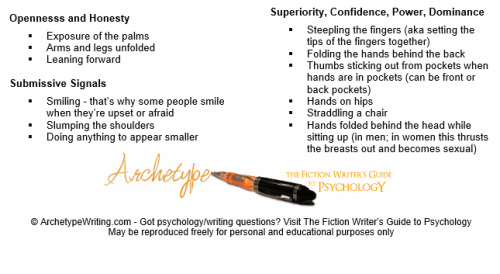
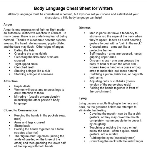
When asked to show a certain emotion (like we did in our study task 3), most people will do something different. People show their emotions in different ways, and a noticable difference is when it comes to introverts and extroverts; the former would most likely be less exaggerated, or less lively with their actions - the latter usually take up much more space.


This is something I would probably have to think about much more when I have multiple characters in a scene, who might not only react with the same emotion but behave differently, but also react with a different emotion. That isn't to say that I shouldn't be taking Moom's personality into account right now, but as it is a short narrative and I have not had much of a change to develop Moom's personality I don't feel like I could do this as well as if there were other characters in the scene to contrast with and react to. Still, it is something useful to think about and I am excited to put it more into play in the future.

Qwertee DD Designs

I decided to go straight for a silhouette style design; I always find them much more interesting, especially for character based T-shirts.


It is hard to see Doflamingo himself through his feathered coat, so I thought that lines might help to make him stand out - the coat itself is very important for his character design, so I didn't want to get rid of it at all. The red lines don't work too well for the design - though it looks good with the pink, the character himself still doesn't stand out enough.

The black lines are slightly better, but the extra detail is too much more the sort of design I'm going for. Less detail will only make him look boring, though.

The black silhouette inside the coat looks much better, but till isn't quite there. I wanted to keep the legs filled in just so that his whole shape is still noticeable, but since the rest of his skin isn't filled in, it doesn't really work. I do like the face a lot better on this though - it emphasises his creepy smile and sunglasses.

Since the top/face have small bits of pink detail, I think that the legs being just outlined in pink works well. The black lines of the coat don't though - I wanted to show the shape of it more, but I feel like is almost distracts from the rest of the image, and isn't really needed.


This version works a lot better - Doflamingo's whole figure is outlined in some way, with the main points of his design (the smile, eyes/sunglasses and coat) being filled in and bringing the audience's focus to them. It is a very minimal design, but that's the sort I prefer so I am happy to have this as my first Qwertee design.

How Does Character Design Affect An Audience and a Performance

Character design is very important in how we perceive characters - people with consciously or subconsciously make assumptions based on a characters' appearance before they even do or say anything.

A lot of this is down to how we perceive shape, and what that tells our mind about the image in front of use. A lot of this is taken from when we were children - things with hard edges, especially like points on a triangle were bad, and round things like balls were harmless and friendly. The shape of a character can be subtle or obvious, but either way it is still usually effective.


The Incredibles use this very well in their character designs, giving you a very good idea of what the characters are like. 


Another good example of this is Maleficent from Sleeping Beauty who is the villain, which is evident by all of her sharper edges and triangle shape as her cloak gets bigger towards the bottom. She is menacing, unfriendly and untrustworthy.

Sunday 28 December 2014

Idle Man Final Designs

I put all of my favorite designs in one document to better compare, and created a template so that I could design a few more ideas from each of them. In the end, I picked the ones that best described the archetype they were designed on, but weren't too cluttered and are simple enough. I actually quite like it as a style guide - another idea of something to do in the campaign could be something like a style guide as above, available on social networks etc with a 'sponsored by The Idle Man' and a link or something similar, but for now I am just sticking with an advert.


Outcast Odyssey Research

I thought that it would probably be a good idea to check out some of the designs already used on Outcast Odyssey cards - I don't want to accidentally design a character that looks too similar to any current ones, but I also want to make sure that my witch would fit in, as well.


There isn't a huge range of female cards, and almost all of the above shows women with a lot of skin and cleavage - not surprising for the fantasy genre, but still disappointing. I would like to try and design a character a little more modest, but at the same time I want to have fun with this project and not worry too much about specific details. 
The characters use a lot earthier tones as is common in steam punk style fashion, so that will help a ot when considering my colours.


I started a pinterest board of interesting witchy or steam punk style clothes and accessories as I began designing, so it will be nice to continue adding to this as I get more ideas. A lot of the clothes already have much more interesting shapes to the sort of ones that I'm used to drawing a lot of different detail so I think that I'm going to have fun designing this.


Monday 22 December 2014

Qwertee DD Ideas 1

A character that is big in both the anime and manga right now is the villain Donquixote Doflamingo. His larger role in One Piece is relatively new so there isn't quite as much merchandise for him yet but he is a popular character online and since the online audience is the one that is likely to be aware of and vote/buy from Qwertee, I think that his character is a good starting point.


Some of the main features of this characters are his facial expressions, the pink feathery coat and the sunglasses that he never takes off. These will be the main things I will concentrate on when experimenting with options. I have also seen the image where he is standing up straighter (3rd image) more often around the internet, so that is his most common/popular pose. I am going to concentrate on that pose I think, because a trademark pose will really put emphasis on the character and who they are.

Saturday 20 December 2014

Vocal Performance

Animated performances can be made one hundred times better by good voice acting. It adds personality and expression to a voice, and can especially be great depending on the genre - comedic timing and different voices are great for comedy, and dark, villainous voices and even evil laughs can be great for dark or action animations.


Eddie Murphy plays Donkey in Shrek, one of my favorite examples of comedic voice acting. Everything he says is extra exaggerated, with emphasis on certain words and, of course, the occasional bout of singing. Donkey's emotions are always plain in his voice - he isn't a character that hides what he is thinking or meaning, so he is an easy character to read, and it makes his performances much more genuine. His voice also sounds great in contrast to Shrek's softer Scottish voice; Shrek hides his emotions a little more, and is much more careful and guarded but as the film progresses he becomes more open and laughs a lot more with Donkey, showing how his character develops, and he stops trying to make himself sound so scary.


On the other side of the coin, Donna Murphy plays Mother Gothel, the sneaky, selfish antagonist of Tangled. She talks and sings in tones that just screams 'I'm better than you' and, of course, 'mother knows best'. She exaggerates the emotions that she doesn't really feel in the video above, to get sympathy from Rapunzel, and often over acts in situations to pretend that she isn't as devious as she actually is. This shows how emotionally manipulative she is, and how she isn't afraid to lie to get what she wants. To the audience, it is very obvious by both her tone and dialogue that she isn't a trustworthy or nice person.


Outcast Odyssey Brief


Outcast Odyssey gives me a chance to design a choice of characters, all of which sound interesting to do. A dragon/monster is good practice for drawing/designing beasts which is new for me, watch/warlock would be very fun to look at detail-wise, and steam punk warrior would be very fun to design as long as I can come up with enough original elements in it - I find steam punk very easy to rely on pre-existing ideas of the genre/style, so that would maybe need some research from some different places.

Again, this competition only asks for an illustration but to build it up to a bigger brief, I'd like to also do a turnaround sheet and expression sheet. This would look a lot better in my portfolio, and could give whoever is looking at it a better idea of the sort of things that I like drawing. I am tempted to go for the witch option just because I have been drawing a lot more males than females recently and it would be nice to balance it out. The designs on current cards and other competition entries on DeviantArt do make their females more sexualised than necessary, so I'd like to stay away from that and make the character a bit more realistic, or at least make her dress how a normal female probably would.

Friday 19 December 2014

Silent Movies and the use of Body Language

Body language is extremely important to animation - it tells you about the character, what they are thinking, feeling, what they are doing and makes the scene much more clear. This is usually exaggerated in animation for different effects, especially when it comes to comedy. Reference is extremely important when it comes to  looking at body language and what your character is trying to say - you can create the movement yourself with whatever emotion you are going for, and then exaggerate the parts of that pose that really convey what it is about. Disney did this with many of their films, even shooting the whole film as live action before going in and animating. This lets them make sure that the characters are moving like a character should, and expression their emotions how they should do.

You also need to consider the audience, and what cues they will understand - not everyone interprets things in the same ways, especially between cultures, although when an animation has sound and music to back it up then this is less of a problem, since the context is already there.

Source: http://westsidetoastmasters.com/resources/book_of_body_language/chap1.html


Silent films do not have the audio context to back it up, so everything has to be much more clear and concise. This makes it excellent reference for animators and deciding on how to make their character animation clearest.

Charlie Chaplin, was a master of this, using over exaggerated facial expressions and body language to add a sense of humor around normal movements. He could also put more exaggeration on the important movements and expressions though, at points where it was the most important to the story.


Chaplin was even studied by Disney animators for his timing and interaction with the audience. There is no doubt in his actions about what is happening an what his character is thinking - even what the character is like, and the atmosphere of the scene despite the lack of colour, making a clear and entertaining performance.

Thursday 18 December 2014

Moom Dope Sheet

The dope sheets for Moom didn't take me too long to do, so I could move on to animating the lips much quicker. I used a mirror to double check the way I make sounds when deciding on what phoneme to use for animating, since the sheet I used for reference would be using a different accent than me - I would have to animate Moom's 't's and 'o's differently to match the way I say them myself, otherwise it won't match up as well.


BW-DIGMEDIA-01:Users:matthew.clark:Desktop:LCA logo.pdf
Simple Dope Sheet
Notes
Sheet

Production:

Animator:
Sound
Action
FRM NOS
W

119
E

120 -124
N

125
TH

130
E

131
M

132
OO

136- 144
N

145-146
H

147-148
I

149-153
T

154 - 156
S

157 - 159
Y

160
O

163
R

164
EYE

165
S

173
L

176
I

178
K

182
----
-----

A

187-194
B

197
I

198 - 200
G

201
----
-

P

207
EE

208-213
T

214
S

215-216
A

217-219
P

221
I

223-233
TH

234-235
A

236-244
T

245
S

248-254
A

255-256
M

257
AW

259-269
R

270-276
AY

277- 297


BW-DIGMEDIA-01:Users:matthew.clark:Desktop:LCA logo.pdf
Simple Dope Sheet
Notes
Sheet

Production:

Animator:
Sound
Action
FRM NOS
W

327
E

329-332
N

333
TH

339
E/UH

340
W

341
UH

345-48
R

349
L

350
D

352
S

354
EE

359-363
M

364
S

366-69
T

370-371
SH

372-374
EYE

375
N

386
L

388
EYE

391
K

396
Y

400
OO

402
V

406
H

407
A

409
D

415-416
T

418
OO

421
M

428
U

429
CH

432
W

435
EYE

437
N

448
TH

451
A

452
T

460
S

462
A

466
M

468
AW

471
OH

478