Again, I want to leave my schedule fairly loose because I know that I don't work well with very specific tasks and times to do them in.
I don't want to spend as long on the ideas part of this project/deciding the story, so that won't take as long as it may usually do.
17 - 31 March - Research
1 - 17 April Tests
18 - 21 April Deciding/planning idea and Beginning Game Design Doc
22 - 29 April Create finished Map
30 - 5 May Finish off everything
And documenting throughout.
Tuesday, 22 March 2016
Thursday, 17 March 2016
PR02: Presentation


The art is shown off in front of the Mayor's Office before being placed in there. In the Bounty Hunter's plan, the Assistant got herself stationed there to carry out her own plan. As the Hunter is patrolling around the front of the building, she takes the painting to make her own getaway revealing the tattoo on her arm as she leaves the room via the window across from the painting [not pictured here]. The Mayor's office is much bigger and colder looking as it is much more professional and less homey. The walls are a blue-ish green colour to contrast with the oranges and browns in the Bounty Hunter's office, and the walls are paneled in a Georgian fashion, as this looks much more sophisticated next to the Bounty Hunter's plainer, modern office.

The Bounty Hunter chose that moment to double check the situation, entering just as the Assistant is escaping. She leaves on the bottom motorcycle, which is smaller and more streamlined to be better used for it's actual purpose. The Bounty Hunter follows, getting on his own motorcycle which is bigger and flashier just so that he can show off.

Wednesday, 16 March 2016
PR02: Motorbike Desgins
Trying to design motorbikes for the characters was very tricky, mostly because I don't really know anything about motorbikes at all. I did a little research and looked at a series of photographs to see which main elements I should focus on designing. I drew a few basic motorbike shapes before moving on to specifics.


Wheels are an easier, obvious thing to think about. I wanted to look at a few different designs because they can definitely add to the 'personality' of a bike. The more patterned 'cooler' ones would be good for the Bounty Hunter as he likes flashier things, and simpler, plainer ones that are functional rather than fashionable would be better for the assistant.

I don't really know much about seats or fuel tanks, so what shape these end up being will most likely depend on the rest of the design and which fits better.

Again, I don't know much about tailpipes but I think that the idea I used for the wheels can be applied just the same here; more simple and functional will work for the Assistant's design, and flashier and bigger, like the bottom left would be well suited to the Bounty Hunter.

I put some of the different shapes and styles together to see what bikes could be made, although a lot of them still look very complicated, which would be very inconvenient for an animator - if I did want to stay with a slightly more complicated design, then thinking about CG vehicles might have to be an option.

I also tried to look at which bits could be changed and exaggerated more to make the bikes look more different. I think that bigger wheels and longer handles stand out and add to the 'cool'ness of the bike, which is well suited for the Bounty hunter. Keeping his bike looking busier than the Assistant's could help to show the important of looks and excess to him rather than function.

The top bike here is the Bounty Hunter's, and the bottom in the Assistants. I think that I have got a decent distinction here between busy/flashy and simple/functional which might be better helped by colour. I could still try to create more extreme/simplified shapes for the bikes which would be interesting but I need to thinking about moving on to the next project soon, so this may have to be explored later instead. I am happy with them for now though, and I think that in colour and with context they will work how they need to.
PR02: Turnarounds


I haven't had a chance to colour my turnarounds in time for the presentation, but I can come back to them later on to do it. I might change to poses as well depending on time, as these are very simple for the sake of getting them done. There are also posing mistakes in some of them but currently the turnarounds work for the purpose they were made to.
PR02: Mayor's Office

Notes: Pointed out - looks too squished (back wall) - should pull out more. Need to add windows, lighting, door and details - flat coloured detail? Chairs are effective so far, can the walls have so,e kind of darker brown to help tie everything together? Did in CYMK, printed off darker, need to test printers/find a way around this for the book I will make.
Finished:

I expanded the back wall and added windows to make the room look much brighter and larger to contrast with the smaller room of the Bounty Hunter's office. I think that the colder colours also make it look a lot more professional, and along with the straight wooden chairs and lack of personal objects or ornaments, I think that it helps to show that this room is meant for business rather than pleasure.
Again I would have liked to test out screen tones and different textures but I couldn't due to time constraints. This doesn't mean that I won't be able to at all, but this might have to be done later on if I have some extra time around the next project. I also need to edit the colours, as on the printer and screens I am currently using, the background looks slightly washed out compared to how it looks on my cintiq screen, so this needs to be rectified before I can print this. Still, I am happy with how it came out, and from designing this and the Bounty Hunter's office, I think I'd like to try to design backgrounds a bit for often.
PR02: Bounty Hunter's Office

Notes: Background outside window needs putting in, needs cleaning up and detail and clutter to make it feel smaller. If some parts are so rounded, should everything be? Test out dresser and paper on wall, perhaps.
Still want more gradients, test out colours lines and think about using screen tone on darker parts (over gradient?)Finished:

I straightened out the bookshelves because making everything curves ended up being awkward and time consuming, and may not be too practical if different shots of the room was needed. I didn't quite have time to add in extra items on the second bookshelf, but the main area of the room as highlighted with the light from the window is the table and bookshelf in the corner. I used an overlay layer to achieve the lighting and deleted it from certain parts of the image that wouldn't get hit by the light and replaced them and other areas with gradients the achieve the kind of lighting that would work for these objects. I would have liked to experiment with screen tones and textures more, but I am happy with how this background has come out using only gradients and flat colours. It doesn't look too busy, and will work well with the characters that I have.
Friday, 11 March 2016
PR02: Assistant Finalised Designs

I wanted to get both the cowboy vibe and the assistant vibe, as they are both important to this character. A lot of the designs have some kind of boots which helps for this, and is also sensible footwear for a motorbike compared to sandals or other shoes. The hardest part was finding a way to obscure her arm to hide a tattoo (which will be kept extremely simple and decided later on - it won't be seen all that much anyway), but also to make it easy enough to reveal it again later on. The glasses definitely help for the assistant design, and are easy enough to discard later, if needed.
I liked the shorter hair, leaving the neck and shoulders more bare - I think this helps to make her taller, by avoiding covering too much of her shape. I still want to keep her feminine looking enough as a contrast to the Bounty Hunter's extreme 'manliness'. I think that the last design show the best combination of this; the waistcoat and boots keep the Cowboy vibe (especially if I colour them brown), the hair, glasses and shirt keep her 'assistant' enough, the sleeve looks easy enough to push up and the face, hair and skirt keep the femininity, meaning that the design hits all of the important criteria that I need. Most of my feedback has been positive towards the last two designs, so I think that my decision is pretty much made.
PR02: Bounty Hunter Designs
After experiment with silhouettes, it was time to design the actual Bounty Hunters themselves.

I wanted to convey his arrogance through his poses, which were interesting to draw in this style. I think that the bottom design on the first page looks too 'cool, post-apocolyptic' style Bounty Hunter which doesn't really work for this character. I like the design of the second one just because it is simple, but a nice combination of shapes and things happening. The cape on the bottom left is cool but again doesn't work all that well for his personality. The open chest of the top right feels a little more vain and, to quote my feedback, 'douchey' - which actually works for him quite well. My classmates also like the idea of him being well groomed, and think that that works well towards the personality that I want, as well as the sunglasses.

The third from the right, bottom row immediately has a lot of personality in his face, but sadly isn't quite the right sort of personality for this character. He could make a good background character, though! On this page, I think I like the third (top row) and second (bottom row) the most. The chest hair makes me laugh, but I think it's also a good indicator of his vanity and arrogance, even more so that the version on the first image. The bottom design is very simple, but I feel like that makes it effective - you know the setting and era that he is in, the facial hair screams arrogance, and he is nice and easy to look at. The feedback that I get seems to agree with this, so I may make my final choice once the Assistant's design is fully decided n, to make sure that they work next to each other.
PR02: Background Artist Research
I wanted to have a look at a few different backgrounds for animation while considering the 'aesthetic style' that I wanted to go for.


Studio Mouette's use of lighting and gradients really sets the atmosphere in this room, and makes it look very positive and comfortable. It would be easy to keep this as just plain, flat colours, but it feels much more believable and life-like this way. The use of more saturated colours within this lighting help a lot, as well as keeping the well lit parts slightly less cluttered; this creates more space, drawing your eyes towards it where the lighter parts also are.


The above two images are from the Japanese animation 'Concrete Revolutio' which I've put here because of the screen tones/texture used. It give it a bit more of a comic book feel, and adds more colours to the image, making them more bright and upbeat, which I want in my animation. There are no black lines to be seen, instead using only slightly darker versions of colours, and making some parts of the background seem more organic. The screen tone covers mostly bits in shadow, stopping there from being too much as to hurt the viewers' eyes.

This then reminded me of Roy Lichtenstein's art. Though he is more known for his are involving characters rather than backgrounds, he has some good mixes of both. Again, the screen tone is only used for certain parts of the image, rather than all of it, and definitely adds to the printed comic look.

I am also looking at some of Kevin Dart's art - specifically this piece and it's use of lighting and gradients. The reflections in the puddles look very realistic, and the areas of dark compared to light pull your eyes to the centre extremely well. This is am extremely interesting and effective background, and I would like to reach that level of detail and interest in my own backgrounds.
PR02: Cowboy Architecture Experiments (2/2)
I really liked the idea of a bookshelf over a corner of the wall - for some reason this looks really good in my sketches, and could she the Hunter's stupidity in not utilising the space in his office properly.

I feel like the box shapes help to keep it small and contained, and then obscuring the corners with furnitures helps the make the room even smaller, as do the TVs. The TVs help again with adding something modern to the room, and I feel like it would be a good resource for the bounty hunter, news/information-wise. I knew straight away that he would have a sofa on one side of the desk, because that's the sort of person he is - comfort is more important to him than seeming professional, so the furniture might more 'interesting' and not like what you may find in an office.

I tested out adding more walls to make an octagonal shape but this didn't seem to work for the Hunter's office, and manages to undo the cluttered-ness. I wanted to keep the door directly in front of the sofa and desk, as the Hunter would enjoy being the first thing that anyone entering the room can see. Having a window behind him stops any glare from affecting his eyes and at times could silhouette the hunter, giving him a very dramatic look which he would enjoy. The glare might still hit the TV, but my feedback said that the TVs looked awkward on the walls so I traded that for a map with Wanted posters around it, which actually helps towards the Bounty Hunter idea and shows his working process. The room also looks nicer with two similar bookshelves rather than one being a smaller shelf than the other, so I think that the bottom right drawing is probably the closest to what I want.

I wasn't sure what kind of chair exactly to have at first - the Hunter seems like he would be tempted by armchairs rather than normal chairs, but he doesn't have to make his guests' seats as comfortable as his own.

I got to the pointier chair design and really liked it - I think that it works alongside his design, since the hunter is very pointy too, and it shows a lot of personality and attitude. I experimented a little with sofa versions of this until I found both a chair and sofa that worked together.
PR02: Cowboy Architecture Experiments (1/2)
I did a few rough sketches of the kind of buildings present here. Most of them feel very 'boxy' when the columns and roofs are added, which could make them seem somewhat boring meaning that extra detail would definitely be nice.


I like the rows of buildings that share the same balcony; this reminds of of flats now, which could help with the mix of modern and Western that I want. The smaller detail around the saloons and bars of the balcony are very interesting, and might not be visible too much in my scenes but could still be worth considering to add to the complexity of the buildings.

I don't want to stick too much to this time period of the interior of the office, since that is where my biggest mix of Western and Modern will be. I would like the room to feel small, but with a lot of furniture - I feel like the Bounty Hunter would want to buy as much as he can for his office to look like a 'real' office, but this doesn't work out too well because of the size of the office. I also like the idea of him having 'trophies' around, possibly on shelves from the people he has captured before to show his pride and arrogance.
Ideas continued in next post!
PR02: Cowboy Architecture Research
Panelling and wood make up much of the architecture of old 'ghost towns' that I looked up that have kept the Old West Cowboy style.

Verandas are very important, helping to support the whole structure and to provide shelter from the harsh conditions. They can often look quite complex and have many adjoining structures.
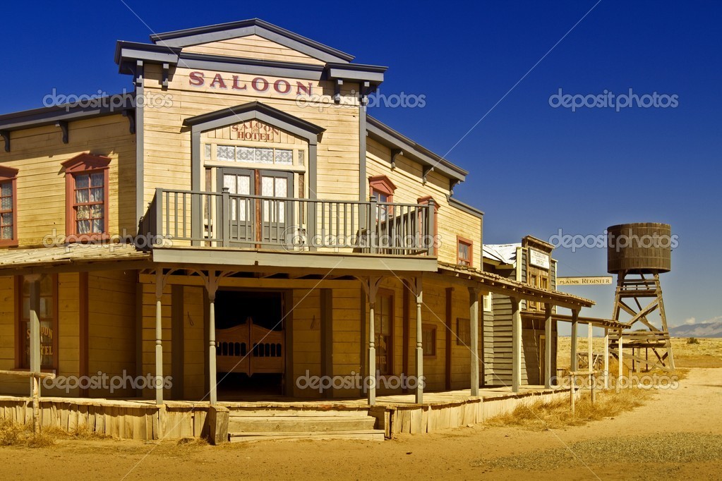
Bright colours to reflect light are quite popular in these kinds of towns which also make the buildings look brighter. Balconies can suggest wealth as well as utilising the space/roofing above the entrances for something useful.

Columns help to supposrt buildings but can also be used decoratively too, especially since the rest of the structures usually have simple decoration otherwise. Roof shapes seem to vary greatly, and there doesn't seem to be one completely unified shape, which may be because of the time and the resources available when made.

I do like the smaller details like the smaller planks of wood on either side of the column, strengthening it's connection to the roof, and the borders along the top of the buildings. I feel like my Bounty Hunter character could have an office that is somewhat small but attempts to push as many of these details together as possible for the sake of seeming 'fancier' and 'wealthier'.

Columns, balconies, wood and verandas seem to be the most important aspects of this architectural style, so they will effect the exterior of his office and a large part of the town.
PR02: Colonial/Georgian Design Tests
I explored the style of American Georgian houses through some drawings (and realised quickly that I wouldn't have time for a full technical version of each, hence the rougher lines below).

It's interesting to see how the level of detail can change the whole look of a house. The bottom left seems more stately and wealthy with it's much more complex architecture than the top left. The central building reminds me of a shop for some reason, and the bottom right does not look like a residential building.

I enjoyed doing the roofs int eh centre of billings, and I realised that it reminds me of the roof/awnings above the cowboy/ghost town buildings I drew earlier. This could make both styles of buildings fit in together more, which I think will be important for building my town.

I did a few quick interiors to help me think about the layout of the room. Longer rooms seemed to be quite popular in the ones that I've found with walls cut into sections and trim along most ceilings. It was interesting to find some more kinds of ornate panelling as well, which would be nice to incorporate into the Mayor's room. The sections can make the rooms larger or smilers, especially with the alcoves that windows can fit into. The inside carries on a lot with the straight lines, with the horizontal lines helping to make the room look longer.

A lot of furniture that I notched only had two legs extremely ornate and the other two were much more simple. I'm definitely glad about that because the ornate detailing takes a while, but those do look very nice.
PR02: Georgian/Colonial Interior
The interior is just as important as the exterior for the Mayor's office - maybe even more, since that is where I'll be concentrating on for some scenes.


The interiors of many colonial American houses use Georgian styles of architecture, including a lot of panelling on the walls. Walls are often filled with different types of ornamentation, leaving no space looking too plain.

Light walls seem to be popular in Georgian rooms, especially to keep them looking larger. I feel like the decoration almost goes against this, since it can look cluttered and make a space seem smaller but it works for showing off wealth.

Ensuring that there is a border around the walls/ceilings also seems to be important, and keeps every wall of the room tied together. Chandeliers and many sources of lighting imply wealth and help in heavily panelled rooms that may not have as many windows as light sources. The wooden flooring is also important to keep in mind, as it seems very important to this style of room.
Queen Anne style furniture is very ornate and popular in Georgian style rooms. I think that this will help to make the Mayor's office a bit more 'fancy' and wealthy, especially if it looks old-fashioned which contrasts well with the Bounty Hunter's more modern seeming office.

I need to keep in mind how much detail will be seen and needed, but it would definitely be nice to keep more detail within the Mayor's room than the Hunter's.
Subscribe to:
Posts (Atom)