After deciding on a pose that looked dramatic enough but would still give Mihawk a readable silhouette, I filled in some of the bigger areas of his design with one flat colour taken from one of the images of him. I like how the silhouette looks already, but there is obviously a lot more I can still do with it.
I added a secondary colour and a bit more detail to see if I could make it more interesting but I think that a lot of the detail gets lost within the black parts of the image.
Adding another shade of purple looks pretty good and the detail is clearer, although on anywhere other than my laptop the contrast isn't quite as effective. The black sections of the image worked a lot better anyway, so I thought I'd move away from so much purple for the next iteration.
I really like how the detail works on here but again, the contrast isn't quite as good on any other monitor. I think the black coat might not work so well on an also black background though - the final image won't have that, but I feel like the design would probably be much more effect on a black T-shirt.
The Animation Portfolio Workshop competition sounds like one that would be great for me an my portfolio - except for one thing;
2015/16 Character Design Contest
Guidelines and Rules
• What is it?
The APW Character Design Contest is a competition in which each contestant designs an animation
character (contest guidelines below). The drawings are judged by a special guest judge – animation
professional Saud Boksmati . The first prize is free tuition for the 2015/16 Session of the Animation
Portfolio Workshop.
• Who is eligible? Only Canadian citizens are eligible. Animation professionals, professional visual artists, former or
present APW students are not eligible. Former or present students of post-secondary Animation or
Illustration Programs are not eligible.
• How does it work?
Each submission will include the following drawings; 4 views of a standing pose (one profile facing
left, one front view, one seen from ¾ right, one rear view); 3 active poses of your character. For
example, running, jumping, dancing –3 poses that have action in them; 4 facial expressions
(laughing, angry, surprised, sad).
Another thing is the consent release form, in which I would be giving up rights to whatever I have created. This is something I will definitely have to be careful about in the future, so using any original ideas I may have wanted to take further would not be a good idea for this competition.
That doesn't mean that I can't still create work for it though - what I would produce for this is the right sort of thing for my portfolio, so I feel like it would be silly not to do work for this.
I decided to layout some of my designs along with the turnaround and expressions so that I could use it for my Behance - I want more than 2 sheets per project, so I thought that this way could show the progression of the character to show how I work.
I'm happy with how my final design came out - I feel like I managed to get it simple enough for animation, if I then wanted to use her later on, if only for practice. Design-wise, I think she fits in with the Outcast Odyssey game (although obviously a drawing style more fit for animation doesn't, but there is no point in me painting the design just for their cards). I also simplified the lace parts of the outfit because it is more of an illustration intended to be animated, and I think it still works nicely enough with the character.
It felt like everything that could go wrong would go wrong on this project - first with the animating, and then when I was finishing my video. Drop down menus and options disappeared from my After Effects, and half of the time it wouldn't play my sounds even though I hadn't changed anything. My animation seemed to have rendered too fast, but eventually I found an option to slow it down and to actually last longer than it did, but this meant I had a lot more trouble matching up my audio to the video. I ended up extremely frustrated in the end and not as happy with it as I could have been, although I don't think it looks too bad when you watch it without the sound. I added a grain effect, vignette and turned it black and white to give it more of an old, romantic sort of effect which works will for the song. Sepia didn't look as good, and I like the contrast that I got with black and white much better - apart from the fact that there is a white box surrounding my grain effect that I changed to be the size of the composition but it rendered wrong, and with how much After Effects and Maya has slowed me down, I don't have time to fix.
Mr Bean is Rowan Atkinson's iconic comedy character, known to most people as a silly, barely ever talking odd kind of man.
Mr Bean uses his face to show his expressions very well, which helps with his lack of dialogue - you can always tell what he is thinking, even if the normal acting people around his are very confused. He acts almost like an alien, not quite understanding a lot of his surroundings or socially acceptable behavior - and making him stand out that makes him a lot funnier.
He makes normal every day routines way more complicated than he needs to, and his incompetence at these task are funny but the fact that he takes this all as being completely normal is almost endearing.
There is even an animated series of the character, which leans heavily on the live actions series as reference. The character looks like a caricature of Rowan Atkinson, and this makes it funnier at times. There is barely any talking, with mostly mumbling to keep the characters seeming like real people.
I don't feel like this brand of humor would work well with dialogue; it would probably feel patronising, too obvious and it would take away from his movements. Mr Bean uses the right amount of sound to physical activity, and it makes this an effective form of comedy.
3D animation is used in many films today, saving so much time and money for the costume department. Obviously this is a newer trend as 3D technology has improved and more software is available to combine 3D graphics and live action, but does this mean it should be used at every chance? What are the benefits of using animation instead of traditional make up options?
I feel like sometimes using CG for character transformation or make up can just really make the character stand out, but not in a good way; often they don't fit into the background, or don't feel realistic enough. They also don't always seem to have a lot of different expressions - obviously the characters behave certain ways and they are in situations where they may lean more towards certain expressions, but I feel like a lot of CG transformations/characters just make them stuck in the same angry expression that, to me, just makes them feel like some generic run of the mill character.
I feel like in Buffy, with the make up and prosthetics they use, the characters feel much more realistic - they look like others, even if they are a little more deformed, and the makeup lets them still move their face as they would normally. Obviously the way that the brows are on the vampire characters make them look angrier, but the expressions that the actor does themselves changes this and does actually make the characters look different to each other.
However, that does not always mean that it is better;
Of course, the quality of the costume/make up could be blamed on the time period that Buffy was made in, but almost every instance of werewolves in film and TV today are now made, or at least made to transform to their wolf self in CG - even as early as 2004, Harry Potter and The Prisoner of Azkaban used CG to make much better looking werewolves, and shows like Being Human, Teen Wolf and Grimm among others use it now.
There are instances where make up looks better - especially for more relateable species and characters that use more human expressions but where beasts are involved, CG seems to be the way forwards.
A great contemporary actor when it comes to physical comedy is Jim Carrey, who uses all of is body to get the right comedic effects. It is over the top at times but most people know what they are getting into when watching a Jim Carrey film, and that means that this humor is to be expected - it is half of the reason people even watch him. Not many people could pull off things so over exaggerated, but he manages - it just looks natural on him.
An example of this is his character in the Ace Ventura series. His character is crazy and over the top but still extremely enjoyable. Even in situations like the 'birthing scene' as above. Even without sound and dialogue, the character's personality comes through extremely well. He moves almost as if he is an animated character with the amount of exaggeration in his actions, but maybe it is the crazy design of him that makes it much more believable.
On the other hand, his character in The Mask is so absurd and unbelievable that that is what makes it funny. He really pushes his facial expressions - although usually involving some kind of large smile, and along with the green mask, his face just always looks manic, but it adds to his performance of someone who really isn't that much of a normal person.
Both Jim Carrey's face and body tends to move in ways that don't look like they should be possible, but it gives him a unique style that has yet to be successfully imitated by anyone else. I feel like it would be much easier to attempt to imitate in 2D rather than 3D animation due to rig limits, but it would be something fun to try out one day.
Physical comedy is a type of comedy that relies heavily on physical and non subtle jokes, including but not limited to pratfalls, silly faces, and walking into walls.
It can be used to lighten the mood in a scene, especially one that is dialogue heavy, although some shows are exclusively physical comedy throughout. These are mostly short, since jokes won't be as funny when they have gone on for too long, and there is only so much material that you could repeat before it completely stops being funny.
Physical comedy might not seem like much compared to comedy based on dialogue, but it takes a lot to pull it off right. This is especially true when it comes to improv; the show Who's Line Is It Anyway involves a lot of physical comedy in games that are based around prompts from the audience.
The comedy wasn't planned out, and that is one of the things that makes it most funny - as the actors try to rearrange themselves so that someone is always standing, lying, and sitting, their scene is being changed and they have to keep a flowing story that fits with their actions. The things that happen aren't always realistic, but this makes it funny, and watching the actors scramble to get into place always gives a laugh too.
Parks and Recreation is an American comedy sitcom that uses a good mix of both physical and verbal comedy. By far some of the best comedy of the show is done by actor Chris Pratt, who initially was only a guest star but worked so well that they kept him on for seven seasons. Both his scripted and improvised comedy is hilarious, and he does it all in such a way that it seems genuine, as opposed to shows that are 100% over the top and obviously so.
I thought that it would probably be better if I go over my designs digitally first, so that they are more presentable, especially if I want to put them on my tumblr or somewhere similar. It also gave me a chance to think about the outfits, how they were put together and what worked or not, so I already had some more ideas on how to develop them when I started the next iteration of designs.
I definitely liked the idea of simple designs with larger, uncluttered areas so I focused on finding what shapes would work well for this, as you can see on the bottom row - I feel that the top half works very well, including the fact that it actually covers up the witch's chest - it is more practical, but at the same time it feels more 'witchy' to me - it almost reminds me of druid/high priestess kind of robes which does give her more of a mystical appearance. The corset is of course classical steam punk, and it works well for breaking her outfit up.
Thinking about the contrast helped even more to figure out which outfits would look more interesting. I found a free lace texture to try out with some of the emptier spaces and I really like the finished effect - it probably wouldn't work so well if the character was actually animated, but for illustration purposes I think that it gives the character a bit of extra detail that really makes the whole outfit that much more interesting.
Another One Piece character that I really love the design of is Dracule Mihawk. He has a lot of little areas of detail which could be interesting for a T-Shirt design, along with the fact that he often has quite dramatic scenes and poses.
I would like to do a limited palette again for him - it was fun for the Doflamingo design, and I think it would work with this character design. I still want the outcome to be quite simple and easy to read, so I don't want to think about any complex composition or extra elements in this.
Today, when I opened my file to work on Moom some more, I was met with this:
So far I am not sure what brought this on - possibly me forgetting to set the project before opening the file, but we will see when I open the original on my laptop again at home. If this isn't just a serious breaking of my recent file, then it's quite funny.
Update: The file is still the same at home. Luckily I save a few different versions of a file nearly every time I finish anything, so my last back up isn't too far away. Not quite sure what I can do in the future to avoid this, though, but I'll keep on backing up files frequently just in case.
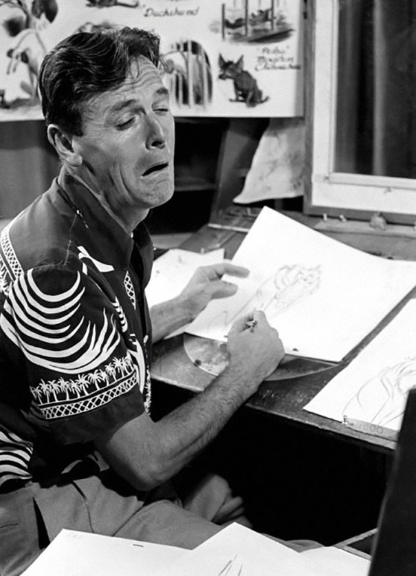
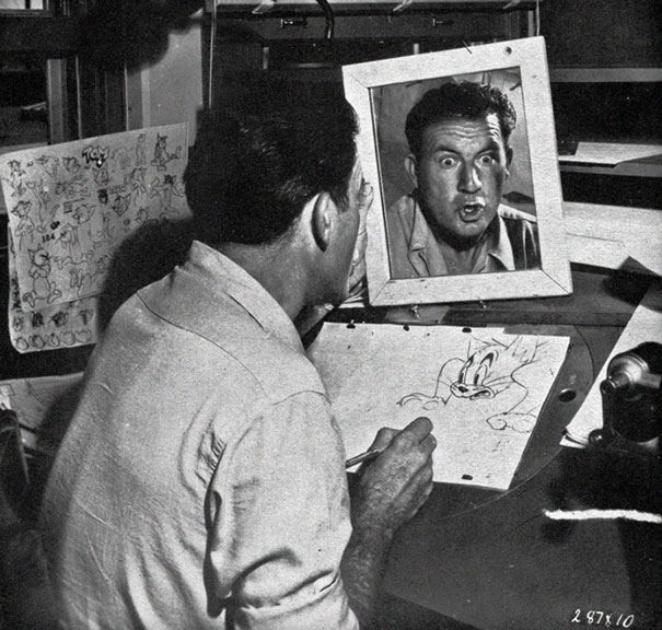
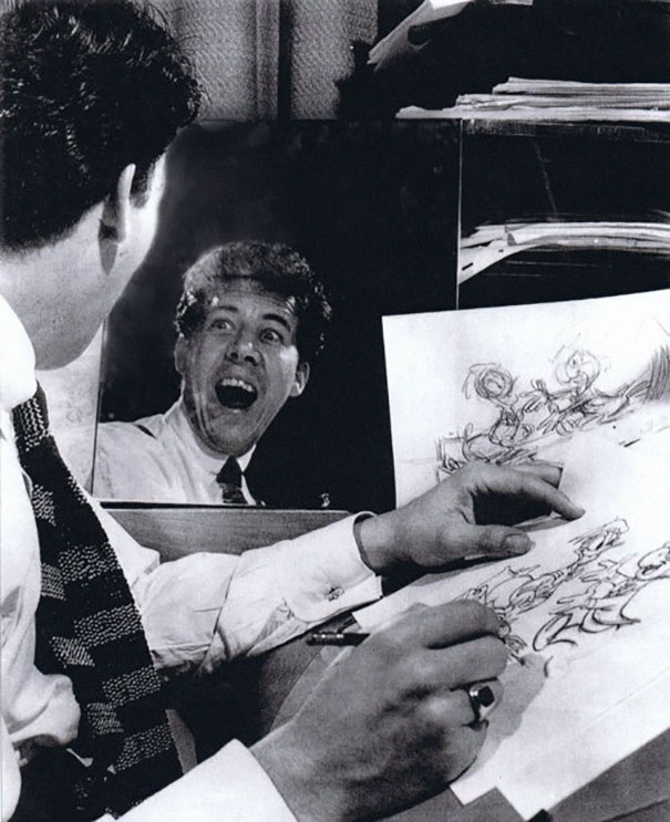
Reference is extremely important when it comes to facial expressions. The easiest reference is yourself, and that is something that animators take full advantage of. Directing someone elses' face is a lot harder, since everyone's faces and ideas of expressions are different. When using yourself as reference, you have much more control over the type of expression you want, and it is easier to explore and find the right one rather than trying to direct someone else. Having a mirror at your desk makes this much easier to, being able to just look over and see it again. Photos are a good alternative though - you an keep them and create a whole library of emotional reference, making it a lot easier to find what you want. There is a risk of using the same sort of reference and expressions each time yo go for a certain emotion though, especially if the collection of expressions is not that big. Using a mirror gives you a sense of spontaneity, and makes sure the artist uses it for more of a loose reference, to tailor to the character than trying to draw that exact face.
How I feel when animating
I find this very good for both animating and drawing, but I find it easy to leave my face in that expressions while doing the actual work, so half of the time I end up with a sore jaw. Well, as a (probably fine) artist said, art is pain.
2014 was a year that held a lot of controversy for animated female characters. One of the earliest was Disney head animator Lino Disalvo, quoted as saying “Historically speaking, animating female characters are really, really difficult, because they have to go through these range of emotions, but you have to keep them pretty and they’re very sensitive to — you can get them off a model very quickly. So, having a film with two hero female characters was really tough, and having them both in the scene and look very different if they’re echoing the same expression; that Elsa looking angry looks different from Anna being angry.” This sparked a lot of arguments about expectations of women and female character, and that it is silly to limit your animating capabilities to keep a character looking 'pretty'.
I found an example of someone using the Mery rig, a character that looks similar to Disney's 'pretty' 3D characters, cycling through expressions. They have animated a wide range of characters, matching more with expressions that male characters may use than Disney females. The animator spared no thought for if this keeps the character looking pretty, and I think it works much better to show extreme emotions. Most people will decide whether or not they consider the character from first seeing the model; adding any expression that makes their face more/less pretty will, in most cases, just serve to emphasise the action or personality than the character, which to me is much more important than trying to conform to outdated societal expectations on an animated character.
Assassins Creed is another example recently that has hand some controversy when it comes to animating their female characters. AC: Unity has a multiplayer mode, letting you choose and customise your own character - the catch being that they are all male. Due to time, resources and priorities, they did not add in a female character even if that was claimed to be the intention, and this statement received a lot of backlash.
In earlier AC games, the female character Aveline got a lot of her movements straight from the character Connor, who was being made in a parallel AC same around the same time. A few walks and runs were changed, but especially with fighting techniques, she used the exact same animations, so the designers made sure that her weapon as close enough to Connor's to replicate.
Connor Parkour/Fighting animations
This shows that everything to create just one more playable female character would not have to be made from scratch - especially considering there is a female character involved in the main game who's model and skeleton could most likely have been used as a base for another generic female character, if the multiplayer male character used everything from the lead male character.
Jonathan Cooper, Animation Director for Assassins Creed III featuring Connor Kenway talked about his experiences animating both genders to Polygon.
"I think what you want to do is just replace a handful of animations. Key animations. We target all the male animations onto the female character and just give her her own unique walks, runs, anything that can give character." The facial expressions would be harder, but temporary solutions could be used.
"You can quite easily put male animations onto the female character, and it can still be good."
Cooper also worked on the Mass Effect series, which gave players the option of a male or female character.
"We made sure that their skeleton was identical so it could be shared across everything. I think maybe the female had shorter arms or something. We might have also replaced some animations like holding a gun or stuff, but otherwise they're just shared across all the characters, all the different races."
This shows that, especially where multiplayer generic characters are concerned, it is not all that hard to add in a female option. They already have a female model within the story line if they needed it, but a lot of things could be reused. This would be more of a challenge if it was more main female characters they were talking about, as the animations would be a lot different, to show the personality and possibly different strengths of the character, but for one that you are not required to think of in regards to any sort of personality? Not as hard as they implied.
Big Hero 6 has a lot of main characters, and as such they all have different personalities. This is very important to show in your animation to make sure that your characters are all actually interesting, well rounded and unique.
The video above is a great example of showing different characters' personalities just from their body language. Of course, their design and dialogue and actions will tell you a lot about them, but body language and mannerisms are something that are harder to control and can give away things about the character that they don't intend on broadcasting or don't realise.
I like how you can see that Baymax tries to be careful but clumsy, whereas Hiro acts like a complete teenager and Tadashi is much more polite but then makes himself comfortable. Aunt Cass acts much more responsible, in a housewife sort of way but then lets her self relax when everything is done. Gogo doesn't waste any time, just rushing in and settling down in a much more casual teenager with disregard for manners, or at least isn't worried about doing things 'properly'. Wasabi takes in his surroundings before then honing in on food and then stretching out. Honey Lemon, immediately draws attention to people she know, standing in the way of the door. She keeps her back straight and walks in a way that makes her seem sensible and sophisticated, which continues on to when she sits down and then takes up more space on the able with her bag. Fred is multitasking, implying that he is a busy person, or just procrastinates a lot - he doesn't even look up when he sits down, and then gets overexcited when sitting down, so he doesn't pay attention to his surrounds that much.
I think that this is a great exercise to do, even when you are still exploring your characters. It is definitely something I would enjoy doing in the future.
Though not 3d, The Lion King is an animated feature that does extremely good character animation. The cast is all animals, rather than human, but it is hard to get reference for an animal acting the way you want to or expressing emotion the way you want to - that's why human acting is applied to the animal characters. Despite having different bodies, this still works extremely well, and helps to add a lot of personality to the animals.
Scar from the lion king is one of my favorite animated performances - he is the sort of character that, if you watched the film silent, you would still be able to understand and feel what sort of personality he has. The exaggerated head and facial movements serve to show his emotions well, but almost always slow enough to show that he is in control of those emotions and is intending to show them. His facial expressions really help to show when he is more smug or sinister, and it is almost easy to forget that he is a lion when you compare them to a human's expressions - they are captured so well, and really help you to show everything that Scar is thinking. In the above video it is so obvious how Scar thinks he is above everyone from the way he looks at them and the way he moves as if he owns the place. It gives a sense of his self importance, even against a character he should respect.
This can be applied to inanimate objects as well - for example, in the film Cars, the cars are somewhat alive and express themselves like human beings. This makes them more relatable and understandable as characters. Through both the body language that we come to associate with human and the car designs - whether they are more round and friendly, or angular and serious, we can see the personality of the car without having to rely on the visual clues we are used to. Squash and stretch are used even more in this film, with a lack of limbs and comparable body parts to animate, so the car body itself has to show much of the actio.
Cutscenes in games have been around for years now, and are something that in most cases, really enhance the story. A lot of videos on youtube show all of the cutscenes taken out from a game to make a mini movie and some of these work really well on their own, showing just how much effort is put into the more cinematic side and story of a game.
Cutscenes are made in two different ways; pre-rendered, and real time. Real time is a cutscene that happens in game, using the console/platform's own graphics and processing power to render out frames as they are shown. This means that the cutscenes might not always look as good as they can, depending on the limitations of the platform and the rig in game.
Pre-rendered on the other hand is when video files are made outside of the game, which are then put into it and play with all of the frames already having been made. This often ups the quality of of the cutscene - they can use better renderers and aren't limited to the technology of the console. A downside of this is that if any characters etc are customiseable in the game, that won't be shown - only the default character will be.
A lot of games now, especially RPGs like to concentrate on customisation and making characters as personalised as possible, like Bioware's Mass Effect or Dragon Age games - this means that real time is a much better option for them. Games like Final Fantasy that prefer characters that rarely change instead have much higher quality cutscenes and don't have to worry about rendering in game, because any differences that you could actually make to a character will only be minor, or not visible at all.
That doesn't mean that cutscenes will work like this forever though - as technology for consoles improve much more, so does the quality of the cutscenes rendered in real time.
Characters aren't watched in a vacuum - there is almost always some sort of background going on behind them (which can include props and other characters that aren't a part of the main scene). The contrast between the shapes of the characters and the background can tell you a lot about the scene, and how the characters will be feeling in relation to their background.
For example, Simba in the Lion King is happy in his usual surroundings, as everything is fairly round and friendly with no harsh edges.
Later on in the story, he goes to the Elephant Graveyard, with old bones and carcasses of dead animals. Everything is much sharper and unfriendly, showing that this is a negative scene and Simba's unease at being there - as opposed to the hyenas with their more angular character designs who are completely comfortable there.
This is a good technique for showing rather than telling the audience about the sort of situation that the characters in, and is used throughout animal but subtly and not to subtly.
With the improvements in technology that we have now, photo-realistic rendering is very popular choice when it comes to digital art. In some case you can't even tell what is physical or what is CG. It can also help when things need to be more believable, like characters or things that would not normally exist.
Just because we can doesn't mean that we should, though; some of the best and most famous work is famous because of it's stylisation, and that is what makes it unique - look at Roy Lichtenstein, or Disney designs. The more photorealistic it looks, the more it could look like someone elses' work - of course concept and composition is important, and artists think about these in different ways, but photorealism can really take away some of the style that makes an artist unique.
The more stylised something is, the less you are limited - exaggerated expressions, actions and features can add a sense of life to something that, ironically, photorealism can't. I feel like it can also reach a larger audience too; children especially are drawn to brighter, more simple designs, the sort of stuff that can sell a lot of merchandise. Things looks much more ordinary with photorealism, and are less likely to be memorable enough, visually at least, to be capable of selling as much. That isn't to say that it isn't a good thing because that can reduce the risk of gimmicky designs or ideas just for the sake of selling,but it depends on how much the artist really wants to make money off of what they are making.
Is this paper, is is this CG?
The answer is CG. Danish VFX artist Pingo Van Der Brinkloev made a set of paper like 3D models using Cinema 4D, and made a series of looping animations for them. The animation looks like it really should be a stop-motion, folded paper animation and I really wouldn't have thought it was CG. Using CG will have cut down the time and cost of making an animation like this by so much, that in this case, imitating life rather than stylising it so much works out, and is probably the best way to approach this.
While I still much prefer stylised works, I can see and accept that sometimes photorealism is the way to go.
- Like the mock up, shows how it could be successful
- Like the board layout, simple and effective.
From my feedback, there aren't a lot of changes to make, mostly just on little parts of it. I think I included most information that I needed on them, and I think most of the layout is eay to read although I might add some more things onto board 2.