After getting feedback on my animatic after the crit, a few people pointed out parts of my animation that reminded them of other older openings, so I decided to check them out to see how they went about animating and show casing characters - and making sure that I didn't unintentionally rip any one off!
I think that the main similarity here is the close up of a hand holding a gun. This is held up for a lot longer than in my animation, and the above sequence also doesn't have the gun shooting - it is like a warning rather than an excuse to show action, showing a theme of the show without being too dramatic. There is also some use of silhouettes towards the end of a woman dancing against a coloured background which is something I thought of initially for my animation before deciding that with multiple silhouettes, keeping the background as a consistent black would be a much better idea.
The Cowboy Bebop opening sequence also uses characters highlighted in different bright colours, again as a key to show personalities and differentiate them between each other. It makes the opening much more interesting, and I do think that it would have been good if I found this opening before I started storyboarding, and there is a lot more going on with the silhouettes and colouring and that would have been very fun to explore in my own opening. Next time I think that I will show my initial ideas and storyboards to people before an animatic so that I can find these similar animations much sooner and study them then.
The Mission Impossible Opening begins with a match being lit and the line of it burning (much like on cartoon bombs, with the fuse burning creating suspense before it explodes) reminded people of the character with the gun in my animation, when he shoots and the camera follows the movement of the laser. Having it continue on over other parts of the animation could have been an interesting idea, but I like how that part of my animatic worked out, with the white of the gun expanding to set the background for the next part of the animation.
I will definitely try to get feedback earlier next time, and have other peoples' ideas influence my storyboards/animatics as well as my own. These are some openings that I never thought to look into, even though they would have worked really well as inspiration for what I did.
Saturday, 29 March 2014
Thursday, 27 March 2014
Title Sequence: Animatic

After presenting to the class, it was pointed out that the villain looks slightly out of place, with no context or explanation, and that it might be more appropriate for the superheroes to be featured before. A few ideas later and it was suggested that I could make a Marvel Comics type opening, with pages from the comic book being flicked through before setting on to the logo. It is usually used before Marvel films rather than cartoons, but there is nothing to say it wouldn't work, and it could be a very fun experience.
I was initially worried about trying to use After Effects to make it as it seems very big and complicated, but actually making the animation was quite simple when I took it step by step, and after I started seeing the similaries to Photoshop, I relaxed quite a lot.

I am very happy with how this came out, although I will probably change the color of the marvel logo to fit more with the red of Wiccan, the first superhero to be introduced straight after the logo. I also have a lot more pages scanned if the opening needs some adding, so I am not as worried about if my timing is off for the rest of the animation. If it is, then I have a solution for now and I will know for definite that that needs more work for my next project.
Monday, 24 March 2014
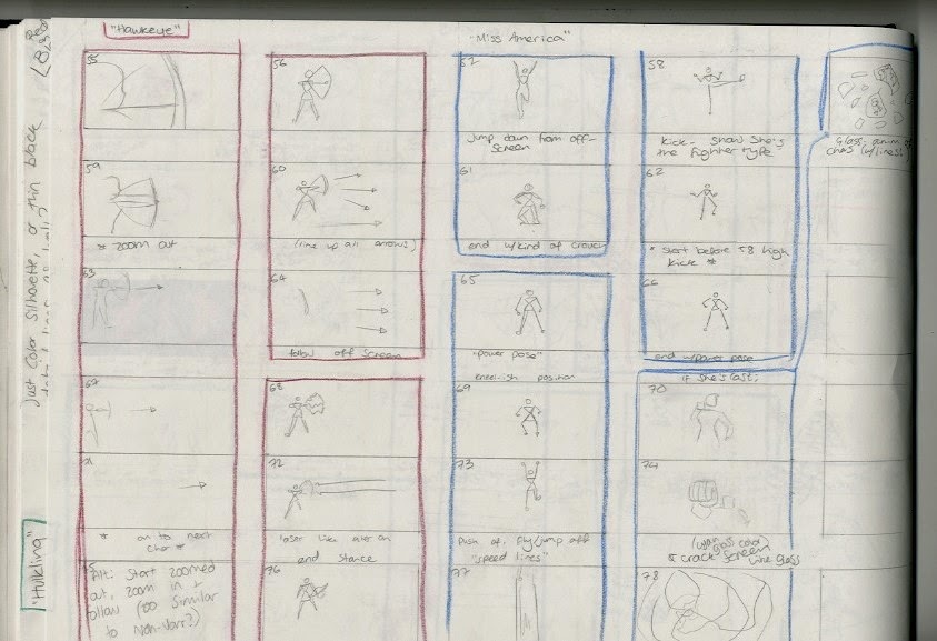
Title Sequence: Storyboards Part 2
Final storyboards

Start: longshot. Show sci-fi element and setting. Introduce the villain who sets the story in motion from the start.

Character introduction, showing their powers etc.

Further introductions

Final introduction, show full team together and background panels with extra information etc.

Close up of team, pan out to show setting (linking with start) and the title of the show.
I feel like the storyboards include everything I want to show and would give the viewer enough information to watch the show if they never had done before.
Sunday, 23 March 2014
Title Sequence: Storyboards Part 1
For the storyboards, I looked back to my notes about things commonly used in cartoon openings (silhouettes, colours, framing etc) and flicked through the Young Avengers comics that this opening is based off to inform me of what sort of things would be effective, and what needs to be included storywise.
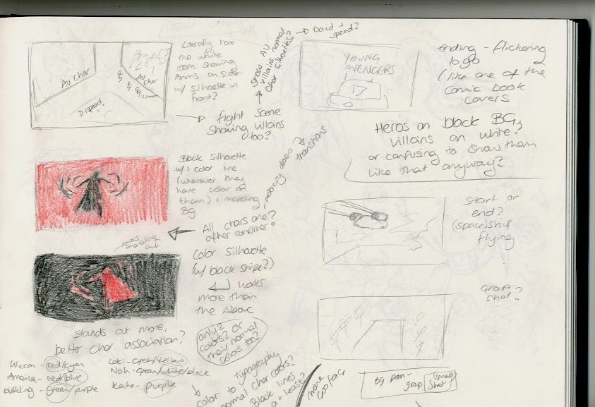
I wrote down some vague ideas of stuff to include as a starting point, with plenty of annotations in case I got stuck.

I started off by looking at a few comic panels, and seeing if I could build anything off them, or use them for inspiration. I found a few panels of space ships with speed lines and nice horizons, which I thought could make for a fun opening shot, so I experimented with some different angles and frames and way of moving the shot to find something that could work.

I also wanted to end shot to somewhat link with the beginning, but also end conclusively. One of the covers of the comics I vividly remembered was a diner set in space with the logo above it, and I thought that that could also be a great way of establishing what show it was. Again, I looked at angles and camera positioning - I knew that a long shot would be a good way to end it, so I found a way to use that in the ending.

Another part of the comic that stuck in my mind was the characters running through a white space with comic panels around them, breaking the fourth wall. I thought that this would a very interesting idea, especially if I could use the panel space to show things that wouldn't have fit in the opening like villains etc. I knew that I wanted some sort of panning on this to show the space properly, so I looked at ways that the camera could move and the positioning of the panels.

I also really wanted to show the villain, who is basically made up of some goopy substance, and breaks off into that when hit before reassimilating. This would be extremely fun to animate, so I thought about having a close up with only that character in the shot (possibly reaching out) and then show her goopy powers.
Then I knew that I definitely needed to show the characters separately as an introduction, so I did a few preliminary sketched to get their personalities down and find some of the poses and actions that they would normally do. Exploring the characters like this was one of my favorite parts of the design process.


I made sure that I had enough boards to have a few different options for each character, in case some got too similar. Some characters were easier to think of ideas for than others, but it was interesting to find what best shows the characters' powers.
Finished Storyboards in Part 2!
Thursday, 20 March 2014
Title Sequence: Character Design Part 2
I decided that I would see if I could get any designs based off of the Adventure Time (Fiona and Cake) style that I liked earlier, as it worked very nicely for the female characters, even if it would need to be changed a little but to make the characters look slightly older. After a little bit of searching, I found a style that could complement it well - Dustin Nguyen's Li'l Gotham style.

I thought that this style would be easier to show both genders, since the shape is not drastically different for each. It also gave me a chance to experiment with parts of other styles I liked, like the Motorcity style and BTAS, using some sharp edges and different proportions.

I then tried out the Adventure Time style properly, making it fit more for an older teenage than a younger one (Fionna). It worked and allowed for some body variation as well, making one shorter and round and one of them taller and slimmer, to reflect to sort of training/work the different characters do. The archer needs to be more streamlined and a smaller target, whereas the 'tank' needs to have plenty of muscle and body mass to throw behind her punches and kicks. This is definitely something I would like to experiment with more in the future; it is a nice change than only being able to show power/muscles in male character styles.

I then refined the male style and lined different variations of it up, to account for the different body shapes that each of the male characters have. Especially after the styles I had tried earlier, it was definitely easy to figure out what proportions and shapes could be changed.

I had to move promptly on to storyboards etc after this because of time constraints, but I was happy with my designs for both genders, and it left me feeling confident about the project.
Wednesday, 19 March 2014
Misc drawings
 |
| Ezio Auditore (Assassins Creed) Pastel |
 |
| Lord of the Rings/Hobbit doodles |
 |
| Doodles of my cats |


I also experimented with some different media (Brusho inks, pastel, brush pen, gel pen) to draw Leatherback, from Pacific Rim. I like how it came out, but I feel like the glowing lights on him could have been better. I'll do more experiments in the future to see.


After watching Labyrinth, I wanted to draw David Bowie's character Jareth, and I felt that this style helps to add personality to him and also make certain parts of the character stand out. I also wanted to experiment more with my brusho inks, making me go a little bit wild on the background. I have started going over him digitally with the Pen Tool in Photoshop to make a pseudo-vector which will be fun to do if I can figure out the style I want do do his face and colouring in.
Face Studies
Faces are one of the things I love to draw. As ever, I prefer to look at the lines rather than just shading etc; it is easy to make things look almost life like with the right shading and depth, but I think it is important to get the character and details of a face across in the lines, as well.

 Bone structure is also important; do they have high, protruding cheekbones? Low ones? Soft ones that you can see at all? A lot of authorative characters, and ones that stand out much more have cheek bones that really get them noticed. Again, age has to be taken in consideration, with younger people generally having less defined cheekbones and when they are older.


Face shapes and lengths are very important I think, especially to show age. Young people will most likely have a shorter faces as they still have time to grow, and will have a lot more soft edges, too.
Some face studies with a brush pen. I like the detail and shading I can get with it, as well as the amount of contrast I can get to make certain features stand out.
I still prefer simple lines though, and I think they can be very effective when used right, especially in exploring line strength. I usually have more variation than in the image above, but I think the with the areas of black, the right things that need to stand out do stand out anyway, and it works well.
This image uses a little more variation, but I didn't do as much detail on the clothes which might have been good. Overall I like the image above this one more, but I do like the detail I have got with this image, especially with areas such as the hair.
Clothes Drawings
I keep finding interesting looking clothes and styles on Pinterest, so I thought it could be fun to try drawing some of these, and figure out how to to do certain textures and details for any important drawings in the future.


I used a mix of fineliners and a 0.4 gel pen for these drawings so that the shape could stand out more, and so the details don't get lost. It was fun to explore the kinds of curves made from clothes actually being warn, as opposed to ones just hung up, or even just on flat mannequins.
I tried out some different media (with ink being especially fun for layers outfits and see through parts, but I still prefer the lineart and making the detail stand out from how it is drawn rather than just what has been added to it.
Shapes in Animation
One of the things I've been doing in my own time is looking at character shapes and how they are used, since character design is an area I have always been interested in. I also thought that practicing other characters could also help me figure out what shapes I find easiest to use, and how consistent shapes are with all characters within one show.


Rob Valley, an animator on some of the Gorillaz videos designed the characters of Motorcity, and it is easy to see how his past work has influenced his design now. The characters all use lot of angles, making the designs, dare I say it, edgy. They are all very strong, confident shapes, which is important for an action driven series like this.
On the other hand, Steven Universe (Rebecca Sugar) use much more round, friendlier shapes. It is less action centres for the most part, with a few more angled weapons when there is violence, but usually it is quite calm and relaxed, reflected in the characters' designs. Some of the younger characters, Like Steven (top left) and Connie (top right) are even more round than the others, showing both their youth and how little they are involved in the violence.
Other designs follow these rules, and a lot more of the characters in fun/comedy types of cartoons are made up of mostly round shapes, with only a few edges.
Again, characters from shows like Powerpuff Girls and Gravity Falls follows this style. I also accidentally ruined this page with ink on the back side of it,so I tried to save the characters by outlining them in white, and I quite like the effect it has had; I might experiment with things like this in the future.
Tuesday, 18 March 2014
101 Dalmations
101 Dalmations shows a very good example of using the human form to tell a story - not just by a reading a character's actions, but by the way their body moves and the direction it moves in.
As Roger starts singing about Cruella Deville, he hunches his body up to make a crude impression of the antagonist, building up the atmosphere as she starts to approach. All of Cruella's body and clothes are constantly moving to show her rushing, and that she likes to get straight to the point when trying to get what she wants.
Mitt Kahl animated the characters of Anita and Roger, and uses the couple's body language to show the direction of conversation, and to draw you in to the important part of the scene, as opposed to a lot of animation that focuses mainly on backgrounds to lead you to the action.

Above shows us Roger's whole body curved towards his hand, even his face tilted downwards so that his nose leads in a straight line down to it. Anita's body and face is curved up towards it, with her nose again mimicking her body and Roger's body language. Both character's body helps to put emphasis on Rogers hand, which is being used to show that he is making a point, and that the dialogue is a big part of the current scene.
nose turn up, his body bent down/round to also direct to the finger - all movement to make a point
Ryan Woodward
It is evident in Ryan Woodward's work that he has studies human figures in details, and is well versed in gesture drawing. This helps in animation a lot to capture movement and action, rather than just moving a stationary figure in a detailed but stiff way.
You can already see in his drawings/animations where he begins to construct his figures, with emphasis on the direction of movement and the character's centre of gravity. This allows his figures to move accurately. His style of animation uses less line and detail for parts of the body that don't matter at that current time, or that are in the middle of movement making the whole figure flow better. They almost look liquid at times, bringing a sense of grace and romance to his work.
Profile Pitch from Ryan J Woodward on Vimeo.
Candy - Test Animation from Ryan J Woodward on Vimeo.
Amor a Vida - alt version from Ryan J Woodward on Vimeo.
Both of these animations swap between an average movement speed and an extremely fast speed, making the solid lines of movement much more effective than just speeding up accurate drawings of specific limbs and such. This must take a lot of care and planning while animation to get the timing and placement of these lines right, and it is only be the knowledge and practice of gesture drawing and the human figure that someone could achieve something that flows as well as these animations.
Tarzan Animation Tests
Glen Keane's work on Tarzan shows a deep appreciation for the human form, and how it works. With the character of Tarzan, raised by apes, he needs to be shown having to adapt his body to their way of movement, while still being within human limitations, and moving as a human would in that situations. Of course, it is probably a little smoother than human movement in real life would be like that, but I still think that it is more accurate than if only an animal's body had been studied and applied to him. It was also important for Tarzan to be stylised enough to fit in with his animal family, but his proportions are surprisingly accurate to say that the character can move in the animalistic way he does. Keane has looked carefully at what a human can or can not do, and this is reflected deeply in the animation of Tarzan.
 |

Above are some images of Keane's drawing exploring the way Tarzan moves. The image on the left is much more exaggerated I fell, but it really brings life to the character and puts an emphasis on the skills and way pf moving he has learned as he grew up. Below is Keane talking about his own pencil tests, and the thoughts he had as he was figuring out the character of Tarzan. He says that through his studies with various other professionals, this was one of the first times that would be animating an actual functioning human body with correct anatomy.
Friday, 14 March 2014
Title Sequence: Character Design Part 1
For the design of my animation, I wasn't 100% sure where to start. This lead me to doing some drawings of one of the characters from the comic, Miss America, as an attempt to visualise what she might/might need to look like.

Still not being too sure what direction to take it in, I thought that it could be a good idea to experiment with different styles from cartoons already aimed at the age group I was looking at for this - teenagers.

One of the ones I liked the most from this page was the one on the bottom row, second from the right - drawn in a kind of Adventure Time style, using Fionna's body shape. I think that the characters would look very cute using this style, but unfortunately that isn't the sort of tone that I am after for this title sequence, and the cartoon that would come after that. The top right one works better for action sort of cartoons, so that was a definite maybe.

The second page was for more of the extreme styles that I knew probably wouldn't work, but was worth trying anyway. I do like the Gravity Falls style one - bottom, second from left, but again doesn't really scream 'superhero'. The Bruce Timm style one, top second from right would automatically imply a superhero series, but I am not a fan of the sexist body shapes and lack of variety for female characters, whereas there are at least 3 different shapes used for male characters in his style.
I decided next to look further at male characters, to see if deciding a style for them would translate easily enough for a female character.

The first two are again Bruce Timm style, and though I think that they look good for these characters, I do not want to do that at the expense of interesting female styles. The furthest right one is one that I like - much more realistic, which means that variety in female body shape would be easier as well, but they would definitely take longer to animate, so that was just a maybe until I could decide properly.

The Adventure time style in the top middle is again cute, but not really relevant for this type of animation. The one to the right is too exaggerated though, taking influence from the Hulk character on Earth's Mightiest Heroes, and again it is a style that would make all female characters look too much the same.
The style on the bottom right from Motorcity actually looks quite good, so I thought it would be interesting to experiment with that further on the male characters.

I can obviously get different enough body shapes for each of the male characters, so it is a style that is definitely tempting to use.

With this style, it is easier to get different female shapes just by changing curves to angles etc, but the design on the far left looks much better I think than the one in the center, and the one to the right that is a mix of them both.I don't want to have one character looking miles better than the other, but then I also don't want to be tempted to make both characters look the same instead.
At this point, I thought it might be good to look at another few styles and see what solutions I could get - shown in Part 2 of this blog post.
Subscribe to:
Comments (Atom)