For the industrial revolution designs, there were again less of a variety in the types of clothing commonly worn, at least within the not-so-upper-class. I feel like having this limit might help keep it consistent with some of he other designs though, and finding small parts of the design to make more unique to Johnny.


The clothing tends to have a lot of emphasis on practicality and work wear, with most variation depending on whether they are inside or outside. Dungarees, shirt, hat and bracers seem to be some of the main components of these designs and within them, hat position and neatness is what changes the most. Johnny would most likely be on the neater side, with his slightly more serious personality, so that is something that I would like to stick to within the design.

I think that the hats to look cute on him, but as with the Egyptian designs, I think keeping Johnny's hair as is looks a lot better; we don't want him to completely look like a generic kid in that era. The bracers make the outfits much more interesting; he almost just looks like he's going to school in the first two designs, and since bracers are uncommon for children nowadays, I think this helps to put emphasis on the era that he is supposed to belong to. I like the no shoes look a lot more; it does put more of a working class spin but I feel like that's a pretty big thing when it comes to representing this era.

I tried out having coats for this design, but I'm not a fan of the shape. The little scarf around Johnny's neck looks cute and adds to the IR feel of it a little more, I think. I think it accurately represents the era and how Johnny would dress within it, so that is the design that we are going to go forwards with.
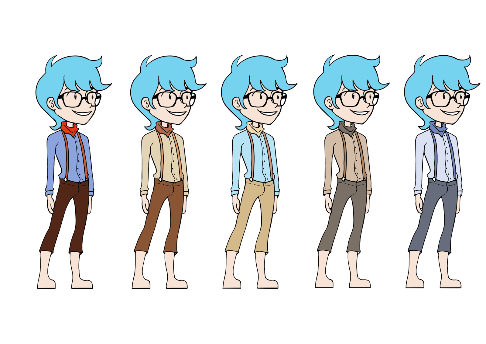
The industrial revolution is again a time with very limited colour palettes when it comes to outfits (especially for the less wealthy). Blue, grey and brown tones are common, which I've tried to implement here. The first colour is by far too saturated for this time period, even if Johnny doesn't actually belong to it himself. The fourth one is much better, but I feel like that colour scheme makes him look too much like a hobbit. The last colour is much more accurate, but just a little too boring.

The less saturated version of the first colour does look better, but I am not a fan of red for Johnny - it doesn't look too good with his hair, in my opinion, and if I was to go with a brighter colour I would rather go with one a lot closer to his original design. I tried that on the second one which worked a lot better; it still feels Johnny-ish, even though it fits in with the time period. The last three were much less inspired, and ones that I could already feel that I didn't want to go with.

I changed the scarf and shirt colours to fit in a lot more with the rest of the outfit. I think this works a lot better, and is a nice mix of Johnny colours and IR colours.
No comments:
Post a Comment